Rebranding Wylth
Wylth is a truly independent, trusted multi-assest platform that empowers independent Financial Advisors (IFAs) to take control of their financial future.Wylth believes that young entrepreneurs and IFAs deserve more. Unlike other platforms, Wylth supports their growth with a commitment to never have its own financial advisory or mutual fund distribution business.Wylth’s cutting-edge technology and expert teams of professionals make it easy to access a wide range of investment, loans, and insurance portfolios, giving you more time to focus on the growth that matters most.
We repositioned Wylth to bring their functional qualities to the forefront - in terms of their ability to provide personalised wealth management services for its clients. Wylth’s new essence, ‘Your Wealth, Our Priority’ captures Wylth’s emphasis in delivering top-notch financial management tailored to their clients’ needs. This is brought to life with the brand’s tone of voice to reflect Wyllth as a trusted and professional brand with the knowledge to help their clients efficiently today.

THE CREATIVE CHALLENGE
- Wylth’s expertise as a multi-asset company remained obscure due to its lack of communication touchpoints to its target audiences.
- Due to the absence of a cohesive brand narrative and identity, Wylth struggled to effectively convey the worth of its services to its customers.
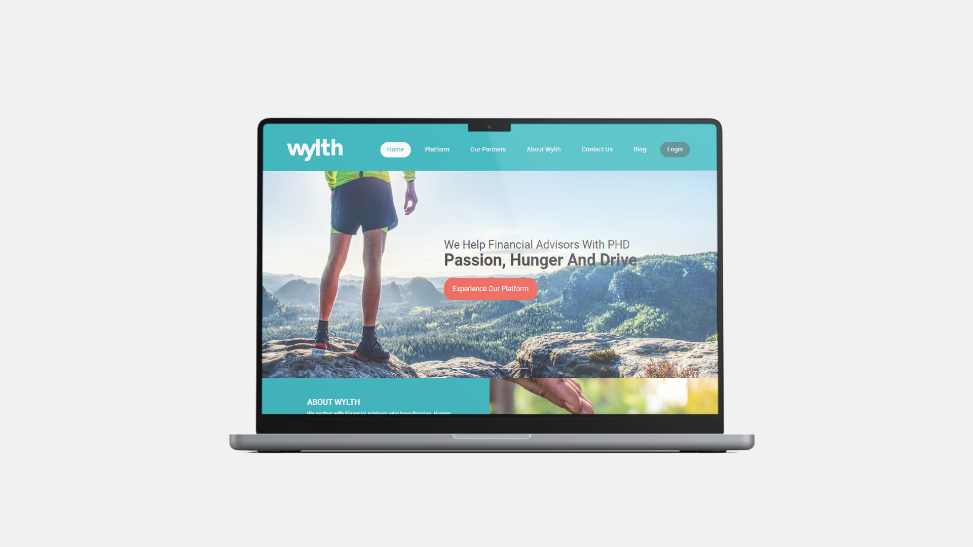
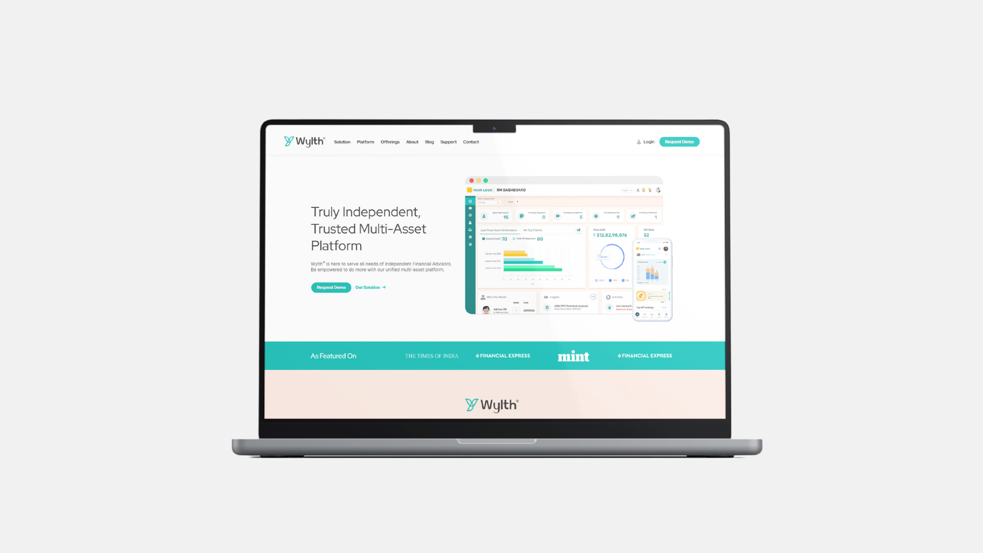
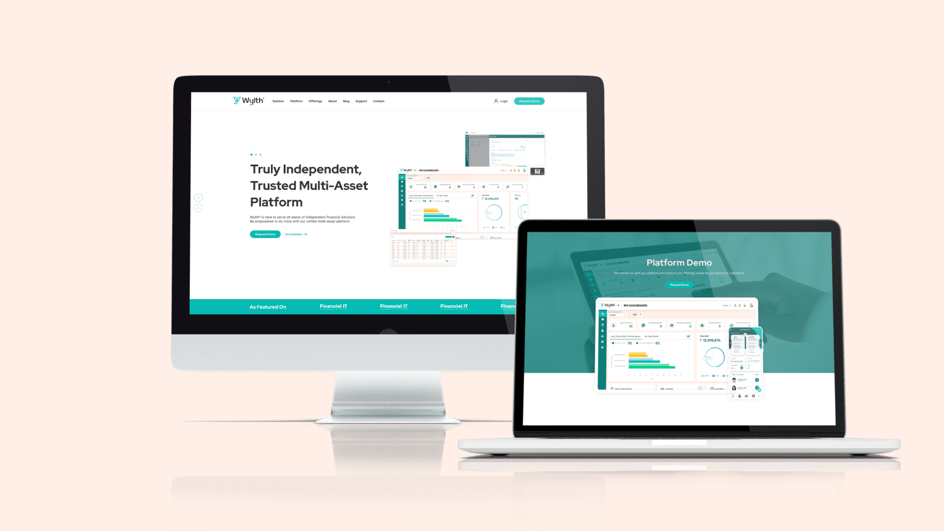
- The website design makes it inconvenient for users to navigate and locate what Wylth has to offer for them.
THE OUTCOME
- With a unique brand position, customers have a higher top-of-mind recall of Wylth and a better comprehension of the services that the brand can provide.
- As a result of gaining a more profound grasp of the brand’s values and its core principles, Wylth has improved its engagement with both new and existing customers, resulting in heightened resonance among its target audiences.
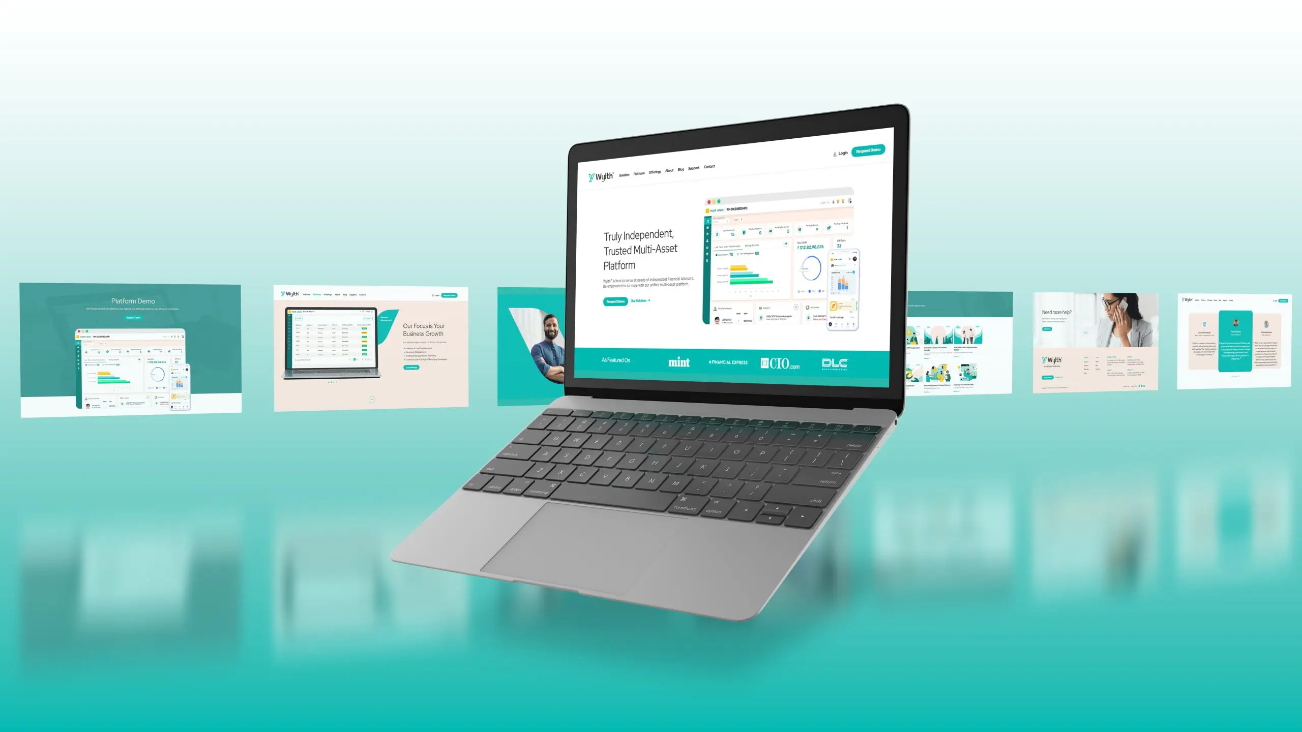
- The structured layout and information organization on the website have made it easier for users to find information accurately, resulting in improved website retention and a boost in traffic.
BRAND IDENTITY
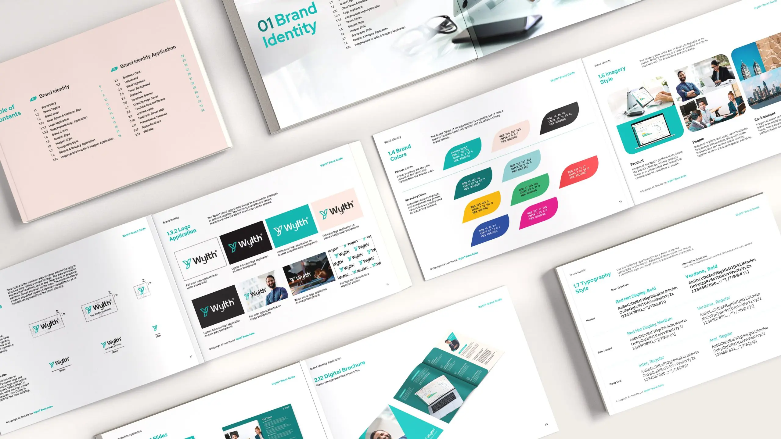
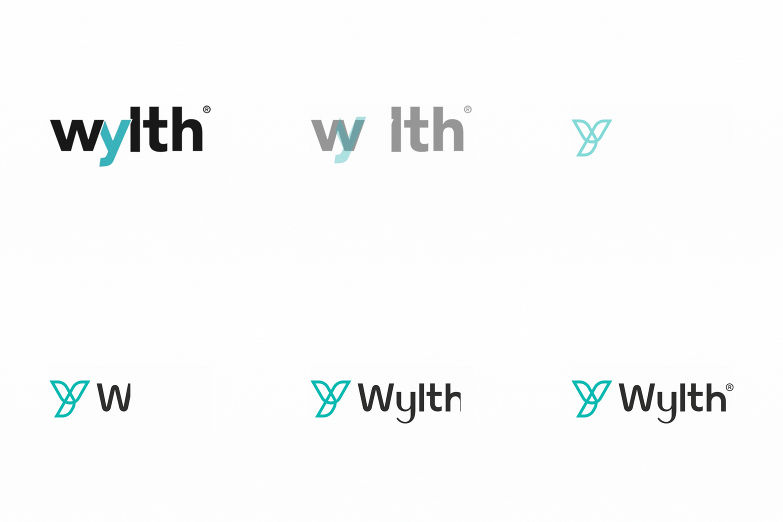
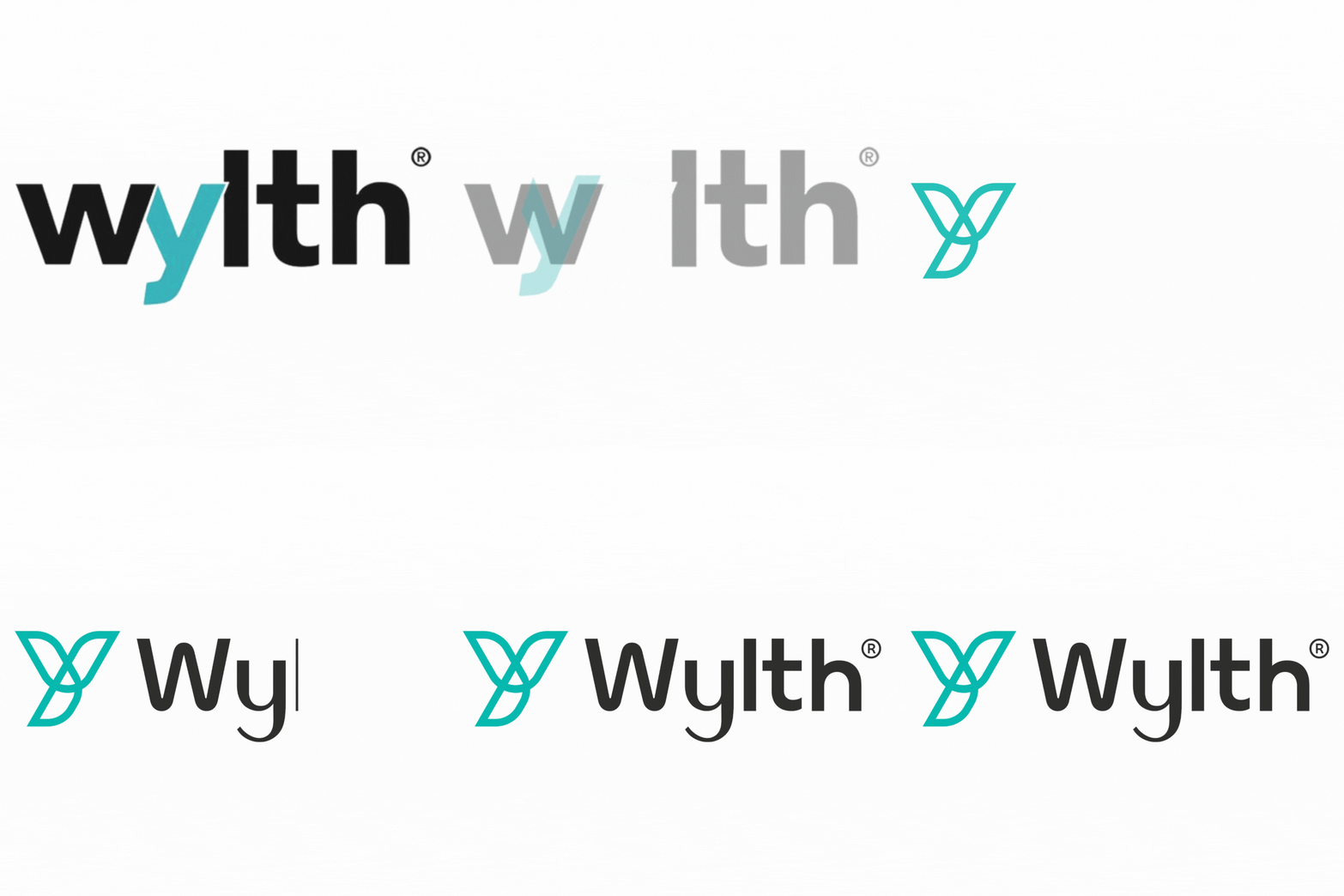
The graphic system expanding from the brand's logo represents the versatility of Wylth and distinguishes it from its competitors by keeping it distinct and recognisable. The logo was designed such that the lines connected altogether to form a continuous “Y”, signifying that possibilities are endless with Wylth, and that it delves in the wealth management industry. The use of the logo as is and its deconstructed forms are reflective of Wylth's capabilities in helping their customers' businesses soar to greater financial heights, and communicates their trustworthiness and transparency.
The overall use of the sans-serif typeface with rounded curves retains the brand’s expertise as well as gives the brand the sense of friendliness and professionalism.
GRAPHIC STYLE


BRAND TOUCHPOINTS
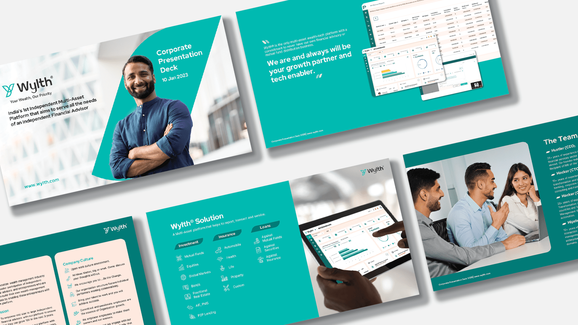
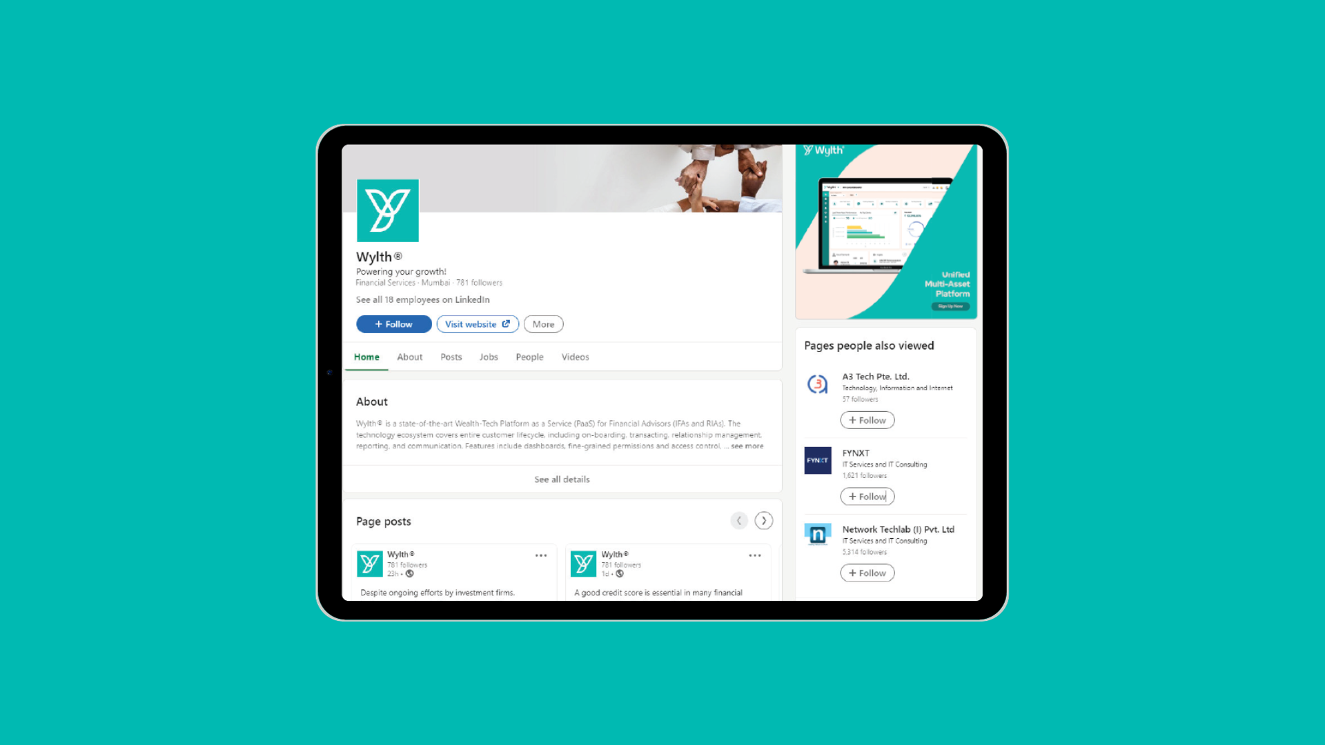
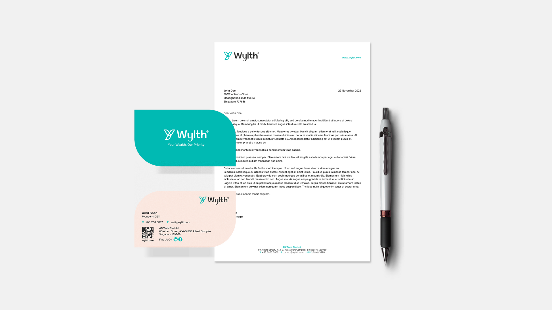
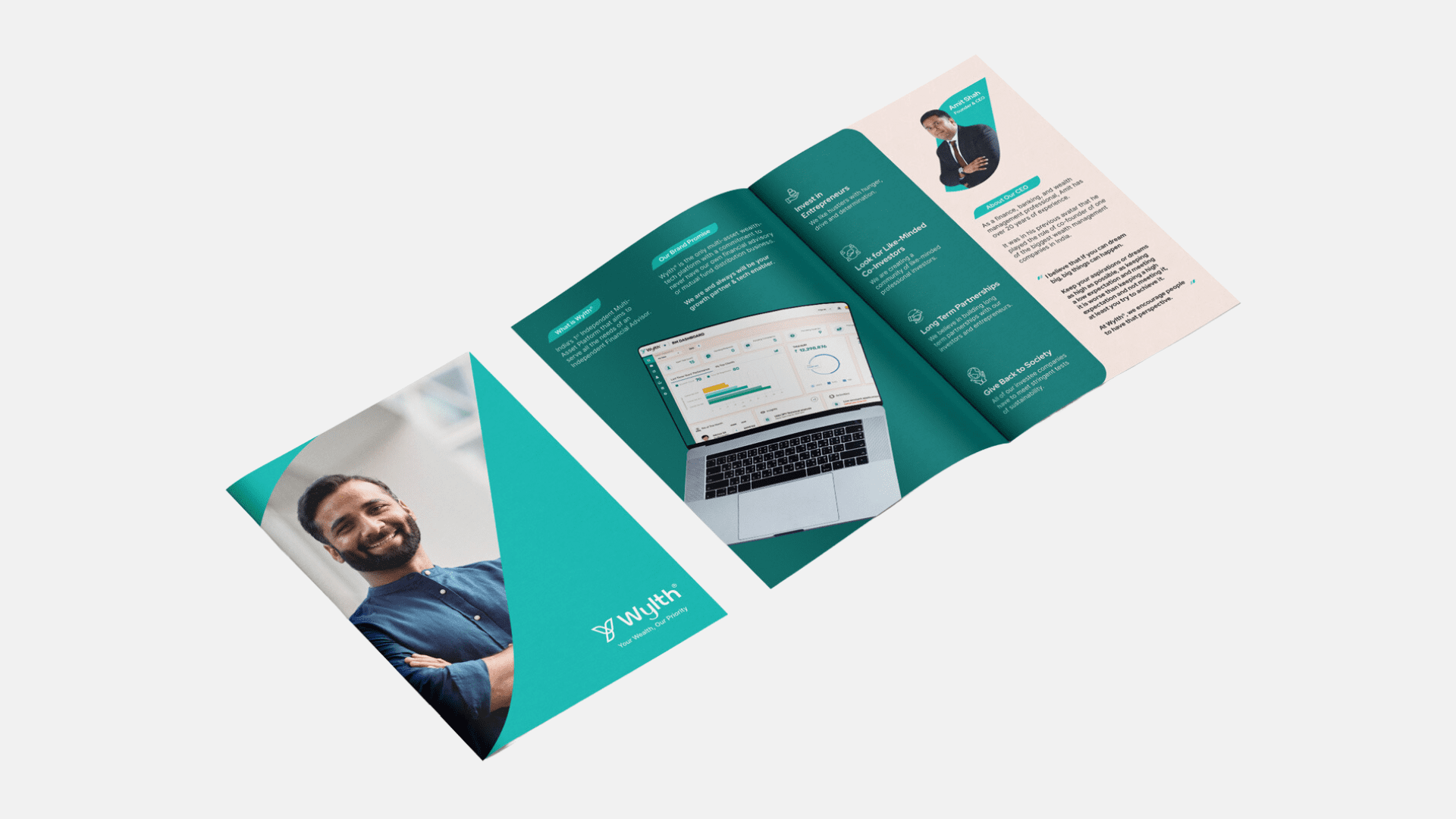
We carefully integrated meaningful elements across Wylth’s diverse points of interaction, including the website, social media, brochures, name cards and corporate uniforms. This was done in alignment with the new brand identity to ensure a coherent brand message and experience.

"Thanks Kimming to you and your team for all your support. Appreciate it!"





 Singapore
  Indonesia
  Italy
Italy