
Rebranding Semec
Established in 1984, Semec Enterprise Pte Ltd has developed into a leading regional playground supplier well known for its innovation and quality. Over the years, they have completed and delivered to perfection thousands of projects in Singapore, providing excellent playground structures and impeccable after-sales service.
By strategically engaging in an in-depth analysis of their brand, we formulated a fresh brand essence, 'Making Play,' for Semec. Also the brand tagline, this new brand essence reflects Semec's commitment to infusing fun and modernity into every aspect of their services, creating a distinctive and engaging experience for their clients.

THE CREATIVE CHALLENGE
- The traditional look of Semec strongly conveys its focus on construction and technical expertise, which presents a challenge for the brand in building connections with potential clients.
- As Semec lacked a unified brand story and identity, it faced difficulties in effectively communicating the value of its services to prospective clients.
- Semec struggles to distinguish itself in the industry, as its competitors present a more contemporary and visually appealing image through various touchpoints like website.


THE OUTCOME
- With a fun, modern and refreshing brand identity established, Semec has managed to forge meaningful connections with its existing and potential clients.
- By gaining a deeper understanding of the brand’s values and fundamental principles, Semec has enhanced client recall and improved their understanding of the services the brand offers.
- The eye-catching and well-organised website layout and information structure have simplified the process of users accurately locating information, leading to increased website retention and a surge in traffic.

LOGO DESIGN
BRAND IDENTITY


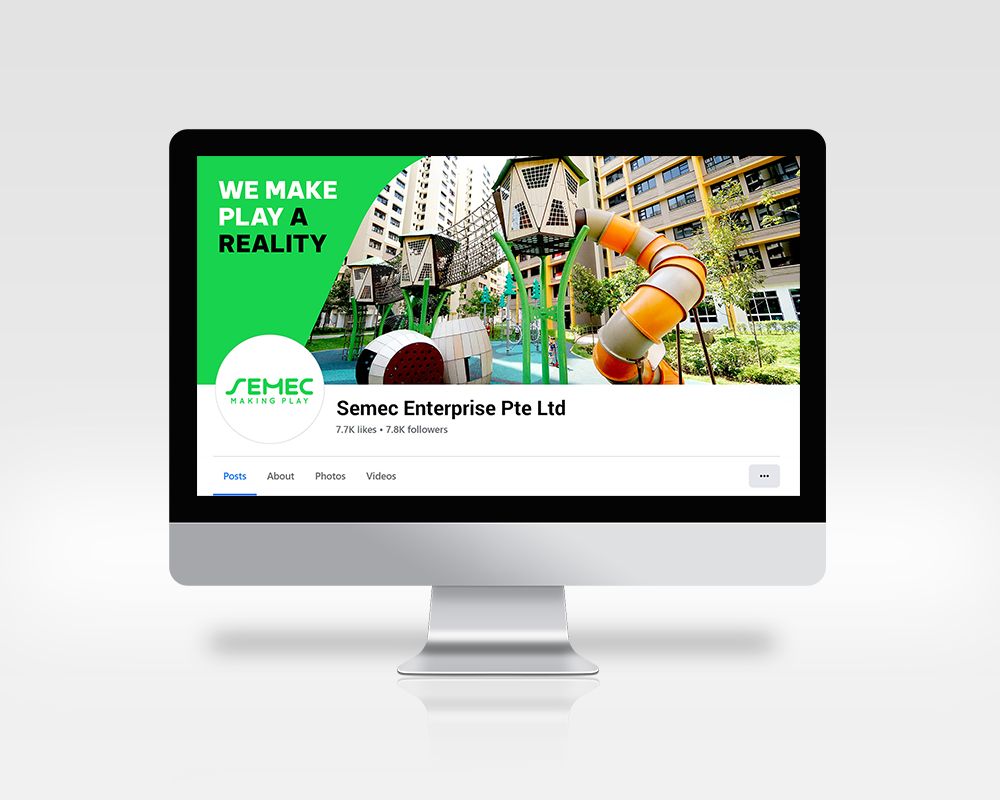
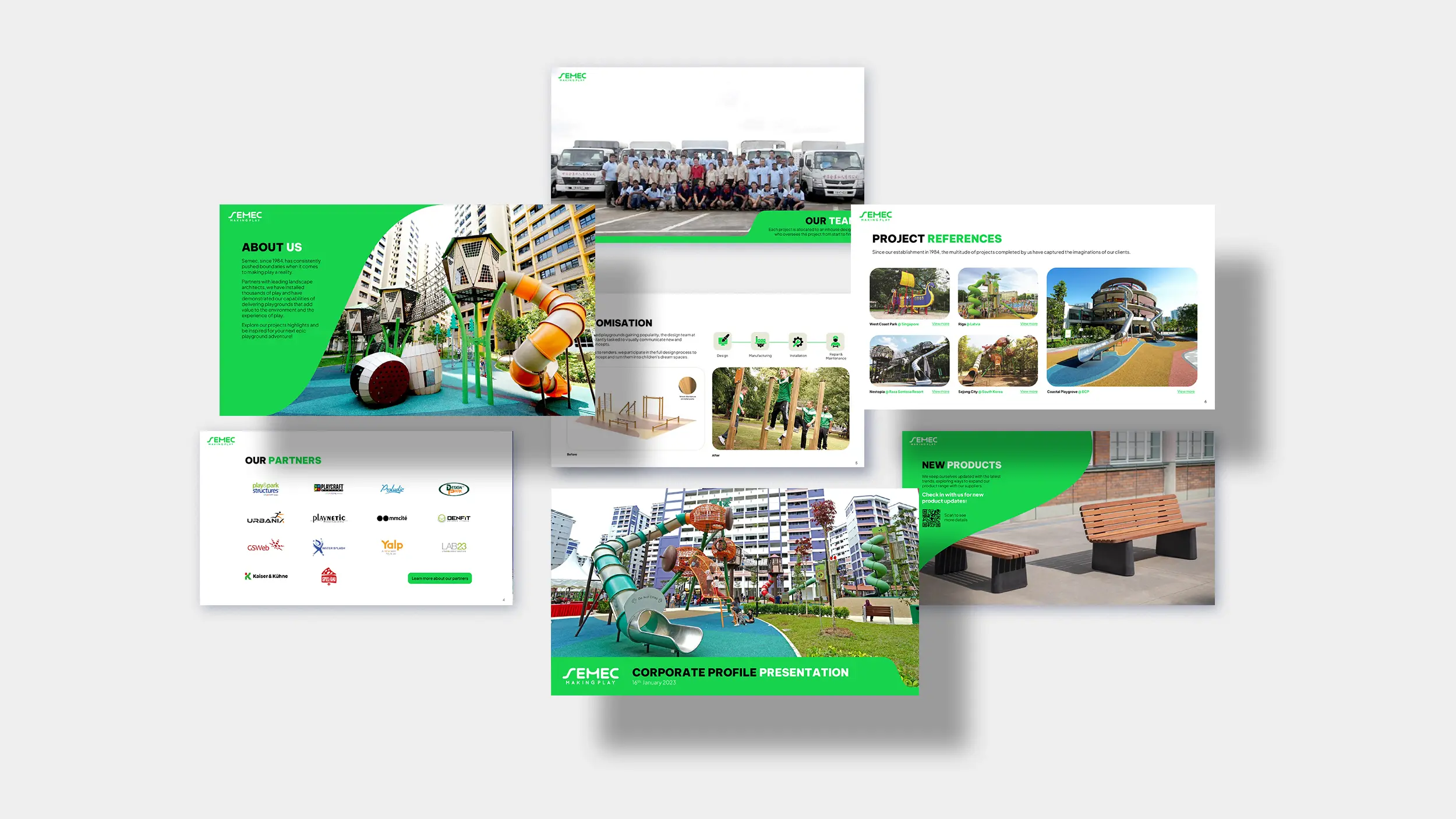
BRAND TOUCHPOINTS
We meticulously incorporated significant components into various touchpoints of Semec, spanning the website, social media, brochures, electronic direct mailer templates, icons, corporate stationery, and corporate uniforms. This integration was carried out in harmony with the new brand identity, ensuring a consistent brand message and user experience.


"As a leading playground manufacturer in Singapore, Semec’s rebranding reinforces its capabilities in design and creativity, and communicates how it Makes Play possible for all."


THE PROJECT MATTERS
We are an award-winning brand and design consultancy. We partner with brands to create projects that matter.
PLAY IDEA DICE
Developed by Creativeans, the Idea Dice helps you through the design thinking process as well as problem-solving.
Business Enquiry
info@creativeans.comCareer / Internship
collaborate@creativeans.com
Creativeans is an award-winning brand and design consultancy based in Singapore, Milan and Jakarta. We build brands that matter.


 Singapore
  Indonesia
  Italy
Italy