
Rebranding Singapore’s leading Kueh Pie Tee brand with a vibrant new identity
Red Lips is a food manufacturer and supplier in Singapore, specialising in Peranakan kueh pie tee and gourmet shells filled with discoveries. We cater to a diverse range of B2B and B2C customers, including Michelin-starred restaurants, award-winning hotels, resorts, caterers, supermarkets, and food-service establishments, providing exceptional food products that exceed their expectations. Using a heritage blend of premium ingredients, our skilled artisans handcraft our offerings daily, ensuring freshness, taste, and crispiness that elevate customer eating experiences. We take pride in creating a harmonious tapestry of flavours that tantalise the taste buds and leave a lasting impression. We are committed to continuous food research, development, and engineering to revolutionise food production and processes. We offer unique culinary experiences that cater to the evolving preferences of modern and contemporary palates. Our customers can rely on us to surprise and delight their senses with our innovative creations.

THE CREATIVE CHALLENGE
As food culture evolves in a highly visual and fast-paced market, Red Lips faces the challenge of modernising its brand while preserving the authenticity of Peranakan culinary heritage. Known for its premium Kueh Pie Tee cups, Red Lips must differentiate itself in a saturated industry, balancing tradition with contemporary appeal. The brand needs to communicate its commitment to quality, versatility, and innovation, while resonating with a younger, design-savvy audience. Red Lips also requires a cohesive identity system that stands out across digital and physical platforms—capturing the imagination of both chefs and casual food lovers alike.
THE SOLUTION
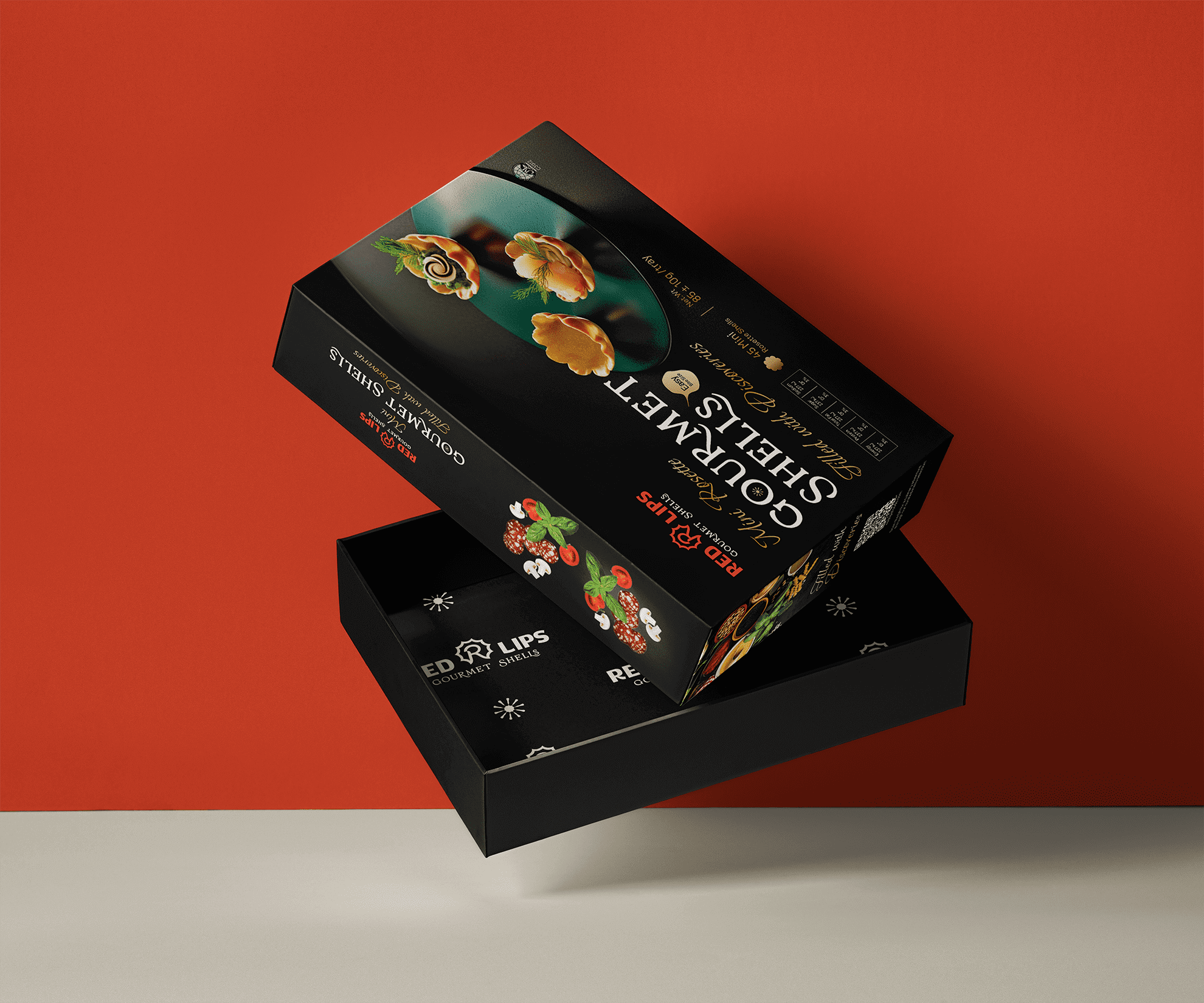
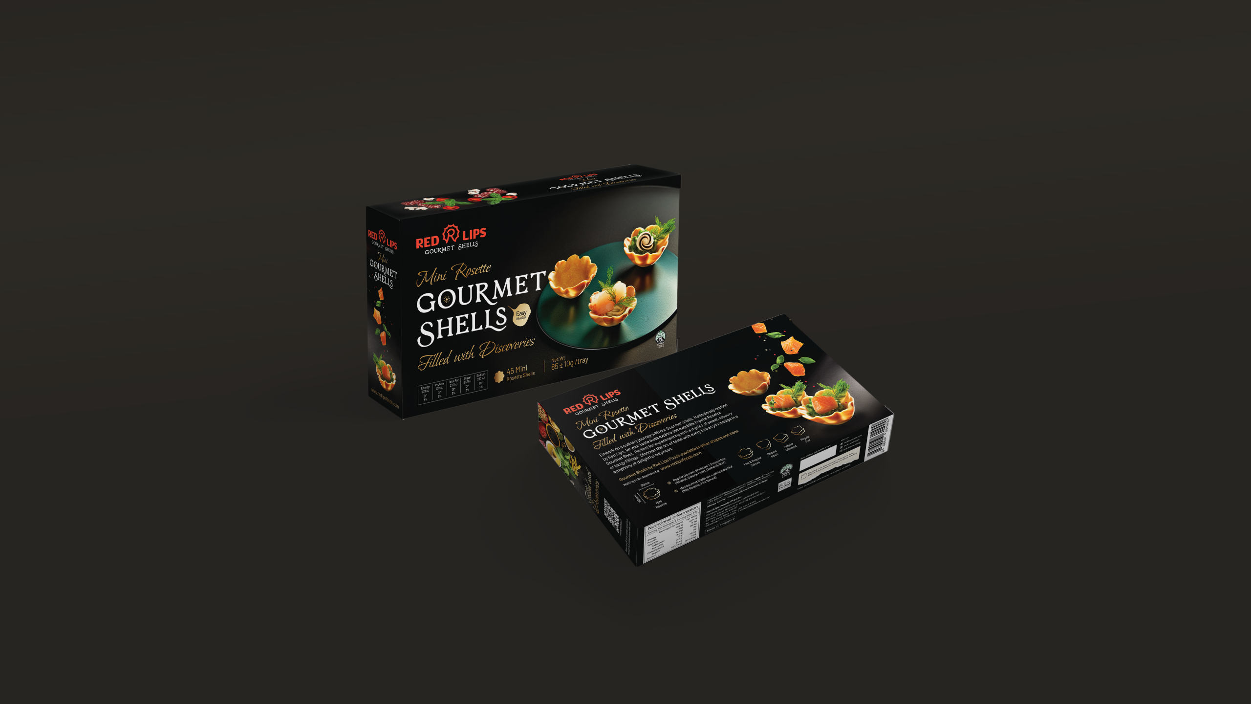
To address the challenge of modernising Red Lips while honouring its Peranakan roots, we embarked on a comprehensive rebranding journey that celebrates both heritage and innovation. First, we redesigned the logo using an R-shaped monogram inspired by the Kueh Pie Tee, symbolising versatility and culinary creativity. This unique form not only connects to Red Lips’ iconic product but also becomes a distinctive visual marker in a crowded marketplace.
Next, we developed a vibrant brand identity system that captures the brand essence of Filled with Discoveries. Bold colours like tangerine red and lime green, along with abstract graphic elements inspired by flavour profiles, create a sense of energy and excitement. This dynamic visual language is designed to resonate with a new generation of food lovers while preserving the brand’s commitment to quality.
Finally, we created a comprehensive brand guideline to ensure consistency across touchpoints, from packaging to digital media and trade communications. The new identity reinforces Red Lips’ position as Singapore’s trusted manufacturer of Kueh Pie Tee cups and Peranakan delicacies, empowering the brand to expand its reach and connect more deeply with its audience.
BRAND AUDIT
We help you understand yourself, your customers and competitors.
WHY AUDIT YOUR BRAND?
A brand audit is a comprehensive assessment of a company’s brand and how its customers and stakeholders perceive it. It involves evaluating various elements of the brand, such as the company’s mission and values, its branding and marketing materials, and the customer experience, to determine its overall strength and effectiveness. Conducting a brand audit is important for any company that wants to ensure that it effectively communicates its brand values and message to its customers and stakeholders. By evaluating the various touchpoints where customers interact with the brand, a company can identify any inconsistencies or weaknesses in its branding and marketing efforts and take steps to address them.


BRAND POSITIONING
BRAND IDENTITY

BRAND TOUCHPOINTS
Red Lips’ brand touchpoints offer a vibrant and cohesive experience across both physical and digital platforms. From its engaging website and streamlined ordering process to its lively social media presence, every interaction embodies Red Lips’ dynamic, flavour-filled personality. The brand’s visual identity, shaped by the bold, energetic colours and playful design, flows seamlessly across packaging, marketing materials, and retail environments. Whether through online customer service, direct product delivery, or in-store experiences, Red Lips ensures that each touchpoint is infused with its commitment to quality, innovation, and customer satisfaction, reinforcing its position as a leading provider of Peranakan delicacies.


BRAND ROLLOUT
The Red Lips brand rollout is supported by a comprehensive brand manual designed to maintain consistency and coherence across all brand touchpoints. This guide is essential as Red Lips continues to grow and expand its presence. The manual provides clear directives on logo usage, typography, color palettes, and brand tone, ensuring that every visual and verbal element reflects Red Lips’ dynamic and vibrant identity. By following these guidelines, Red Lips can deliver a unified message that resonates with its audience, strengthens brand recognition, and fosters trust. The brand guide equips both internal teams and external partners with the necessary tools to consistently represent Red Lips in all future applications.

"Red Lips’ rebranding journey has been an exciting fusion of tradition and innovation. By capturing the essence of Peranakan heritage and infusing it with modern design elements, we've helped Red Lips carve out a distinctive and dynamic identity. This transformation strengthens their position as a leader in the food industry, allowing the brand to connect with a wider audience while staying true to its roots of quality and authenticity."


THE PROJECT MATTERS
We are an award-winning brand and design consultancy. We partner with brands to create projects that matter.
PLAY IDEA DICE
Developed by Creativeans, the Idea Dice helps you through the design thinking process as well as problem-solving.
Business Enquiry
info@creativeans.comCareer / Internship
collaborate@creativeans.com
Creativeans is an award-winning brand and design consultancy based in Singapore, Milan and Jakarta. We build brands that matter.


 Singapore
  Indonesia
  Italy
Italy