
Redesigning Protequa
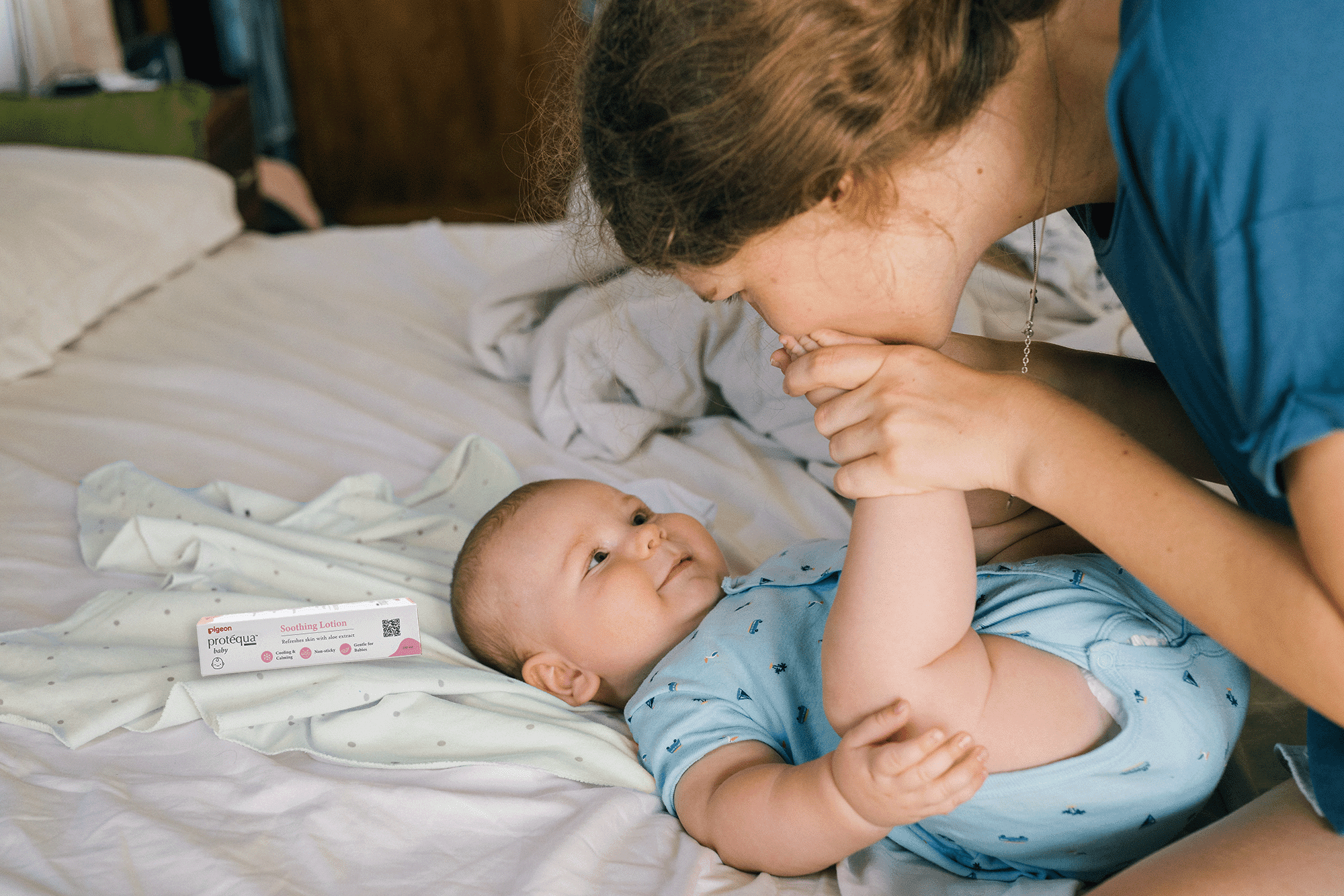
Baby skin is thinner and more delicate than adult skin. It is more susceptible to external irritants and therefore needs extra special care and protection. Hence, Pigeon's sub-brand, Protequa was born from a clear objective – to offer cost-effective specialised skincare for the masses, giving parents the peace of mind that their babies will always be comfortable and free from any discomfort.
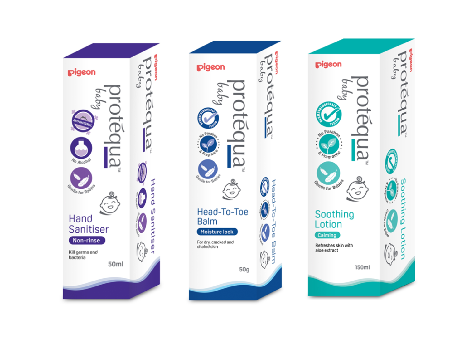
The pastel colors convey a gentle and delicate appearance that appeals to a baby-friendly aesthetic. The icons are simplified, resulting in a clean and visually pleasing design. This straightforward design approach simplifies information for busy parents who are always on the move.
THE CREATIVE CHALLENGE
- Protequa’s packaging appear outdated resulting in a lack of resonance with its modern consumers.
- Lacking distinctiveness, it is difficult for consumers to differentiate Protequa’s products from competitors.
- Consumers are unaware about the unique selling points of the product as its packaging fails to effectively communicate the various benefits of it.

THE OUTCOME
- The redesigned packaging had greater appeal and relevance to the young audience, consequently expanding its potential customer base.
- The revamped packaging caught more consumers’ attention and successfully conveyed the product’s benefits to its audience.
- Consumers were able to distinguish Protequa from its competitors, subsequently fostering a more extensive and loyal customer following.

HOW WE DESIGN PACKAGING

Information Hierarchy
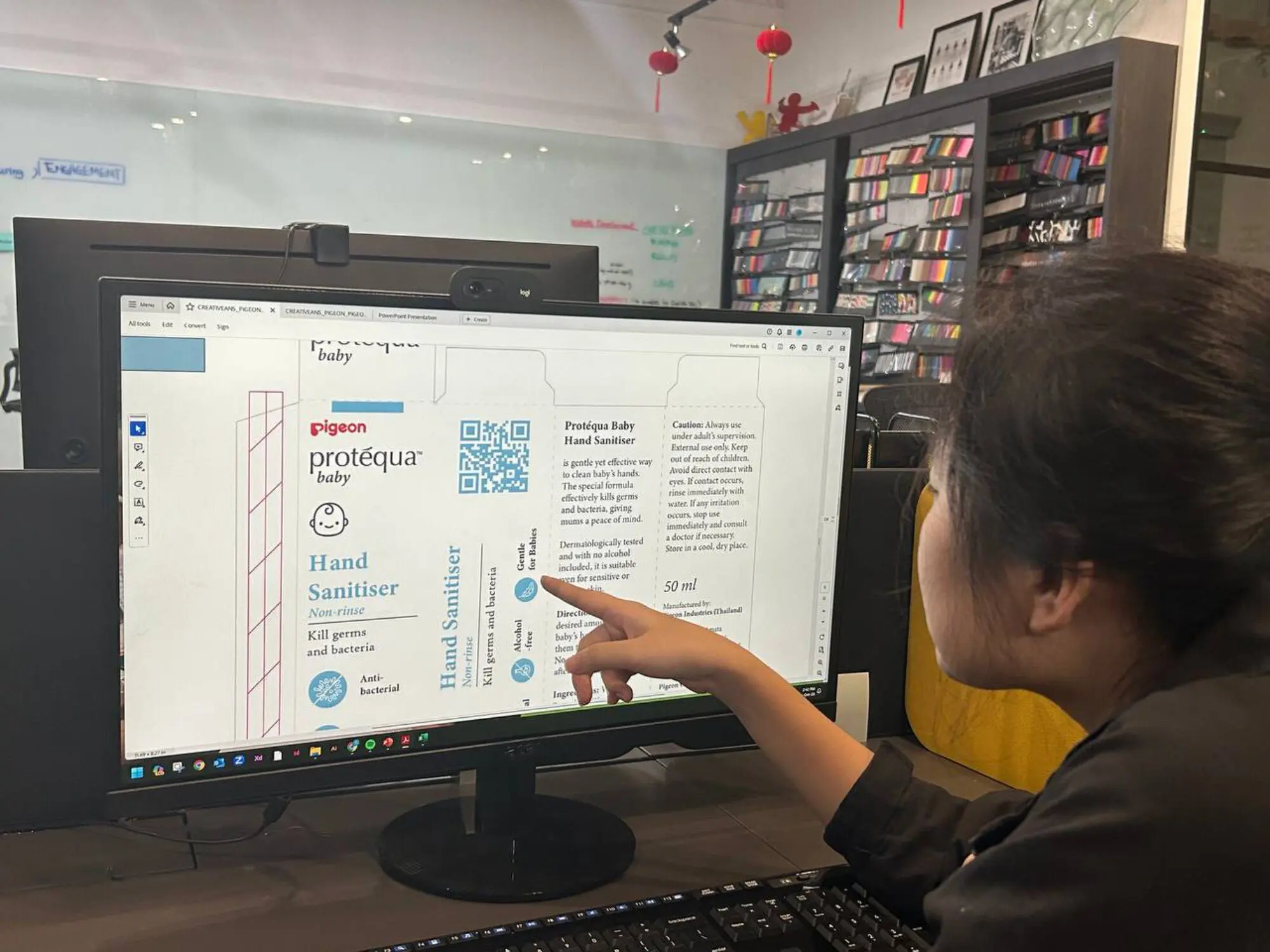
We organised the design with a clear order of information, including logos, icons, text, and patterns to make it easy to categorise products. Our carefully curated text not only conveys essential product information but also tells a compelling story, engaging consumers and highlighting the unique selling points. This information hierarchy effectively convey the product’s message to its intended audience.


"The new Pigeon Protequa packaging clearly sets itself apart from the competition with a design that conveys quality and trust for mothers that care for their babies."


THE PROJECT MATTERS
We are an award-winning brand and design consultancy. We partner with brands to create projects that matter.
PLAY IDEA DICE
Developed by Creativeans, the Idea Dice helps you through the design thinking process as well as problem-solving.
Business Enquiry
info@creativeans.comCareer / Internship
collaborate@creativeans.com
Creativeans is an award-winning brand and design consultancy based in Singapore, Milan and Jakarta. We build brands that matter.


 Singapore
  Indonesia
  Italy
Italy