REBRANDING EDUTECH
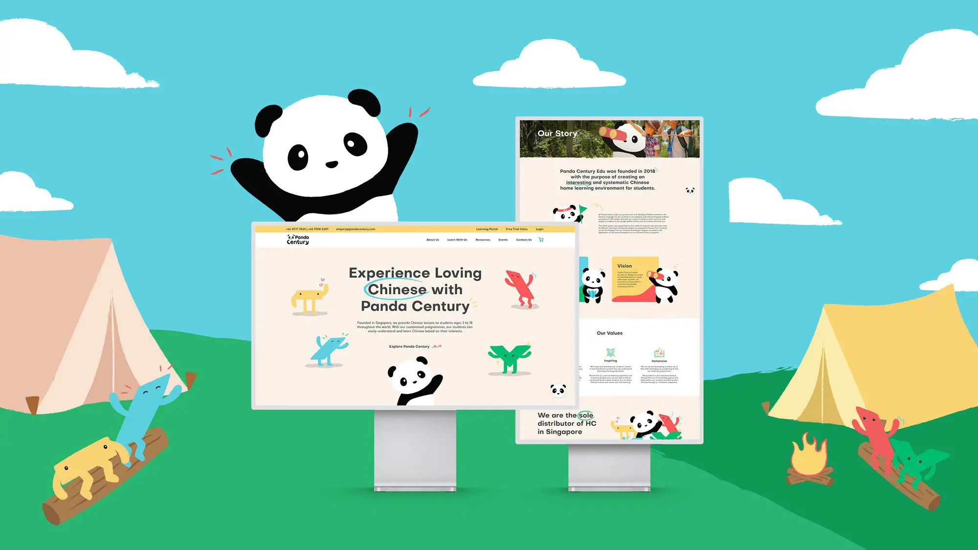
Panda Century Education Pte Ltd is an online Chinese learning platform headquartered in Singapore that globally provides Chinese lessons to students aged between 3 to 18 years old. This brand refresh puts an emphasis on Panda Century’s experiential attributes of their interactive classes and integrated experience that redefines learning Chinese for students.
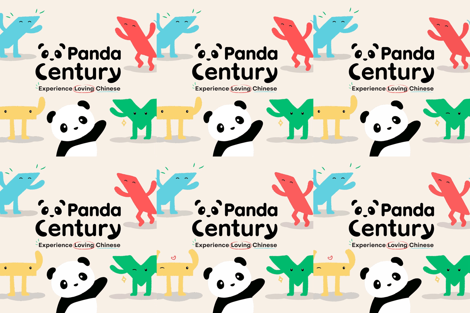
Panda Century's logo portrays the idea of care and support, conveyed by the arms of the illustrated panda on both ends of the letters 'C' and 'Y' to replicate the motion of hugging. Hence, this communicates the support Panda Century has for their students not only for their best interests, but also with their beliefs. Overall, the logo focuses on Panda Century’s core values, making the brand to be fun, interesting and inviting, exemplifying the experience of loving Chinese.
Panda Century is also the proud recipient of the Indigo Design Awards Gold in Branding for Kids 2023 and Silver in Branding for Technology. View the award here.


THE CREATIVE CHALLENGE
- Panda Century lacked brand awareness due to its reputation heavily relying on word-of-mouth and the general confusion about the brand’s offerings.
- The lack of a consistent brand identity made it difficult to for Panda Century to stand out amongst its competitors in the market.
- Students perceive learning Chinese as challenging and intimidating as a result of the language’s many components and intensive lessons.

THE OUTCOME
- Panda Century’s new brand positioning better highlights its ability to cater customised programmes to its students’ interests and needs beyond simply improving their grades.
- Panda Century’s newly adopted cohesive and unique brand identity effectively differentiates the brand and its experiential attributes, creating greater top-of-mind recall.
- Panda Century’s refreshed brand identity and logo make the brand more approachable, thereby making learning Chinese more fun and less intimidating for new and existing students.

BRAND POSITIONING
Panda Century's new brand essence, 'Experience Loving Chinese', captures their interesting and inspiring customised Chinese programmes that Panda Century aims to provide for their students globally, ultimately creating an immersive learning experience. The brand essence is brought to life with the Explorer tone of voice to reflect Panda Century's knack for customising lessons beyond the classroom, and inculcating Chinese culture and values into their students' learning.
BRAND IDENTITY
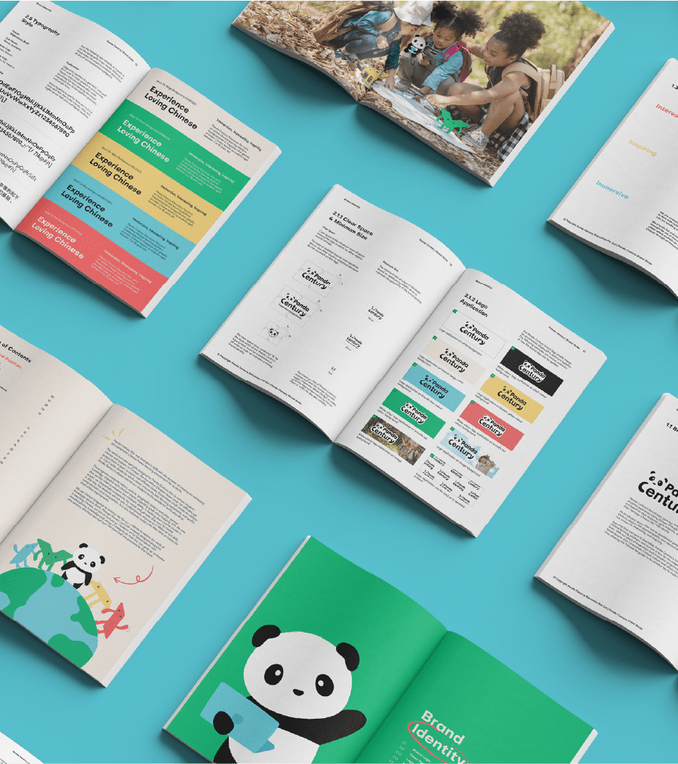
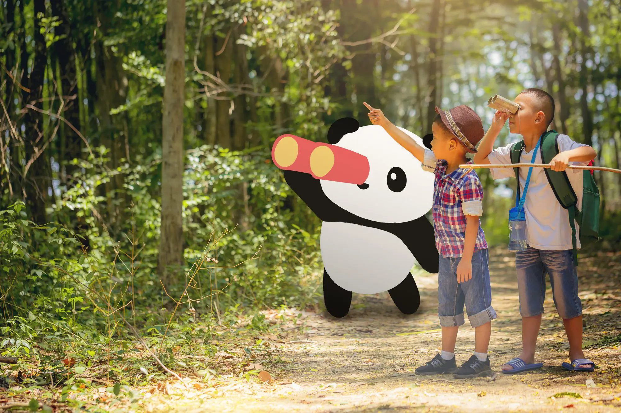
Altogether, Panda Century’s playful character illustrations and bold colours communicate their passion for creating immersive Chinese lessons for students around the world, leveraging their unique customised experiences that set them apart in the EduTech space. With Panda Century, Experience Loving Chinese.


BRAND TOUCHPOINTS
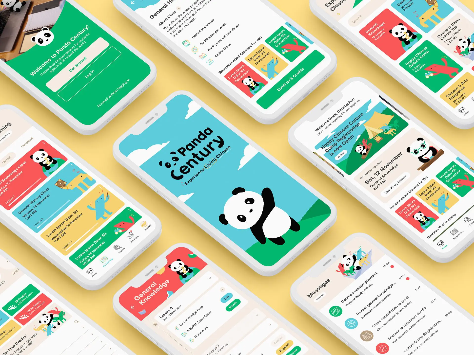
To reach Panda Century’s customers online and offline, we developed a wide range of touchpoints that seamlessly incorporates Panda Century’s new brand positioning and identity. This includes business cards, letterheads, e-brochures, PowerPoint slides, tote bags, notepads, app, website, and more.
These touchpoints are essential in forming a unified and consistent brand experience for Panda Century’s customers. Combined with Panda Century’s new colour palette and graphic identity, the wide range of touchpoints demonstrates the versatility of the graphic style in conveying the brand’s message effectively.


"I would highly recommend Creativeans for their exceptional branding services. They truly went above and beyond to help us create a brand that reflects who we are and what we stand for."


 Singapore
  Indonesia
  Italy
Italy