Rebranding Sanitary Ware
Louis is a premium sanitary ware brand that strives to raise public health standards around the world.
This rebranding exercise repositioned Louis to shift from being an ordinary sanitary ware supplier to one that embodies life, inclusivity, excellence, and smartness. This is communicated across Louis' full suite of products and services, along with their logo, colour palette, graphic style, imagery, and accompanying key visuals.
The result is a calming, restorative, and luxurious symbolic brand that stands out amongst competitors.


BRAND POSITIONING
This is brought to life with the Creator tone of voice to inspire confidence and assurance in Louis' wide range of products and services, making the Louis brand cohesive and distinct.
BRAND IDENTITY
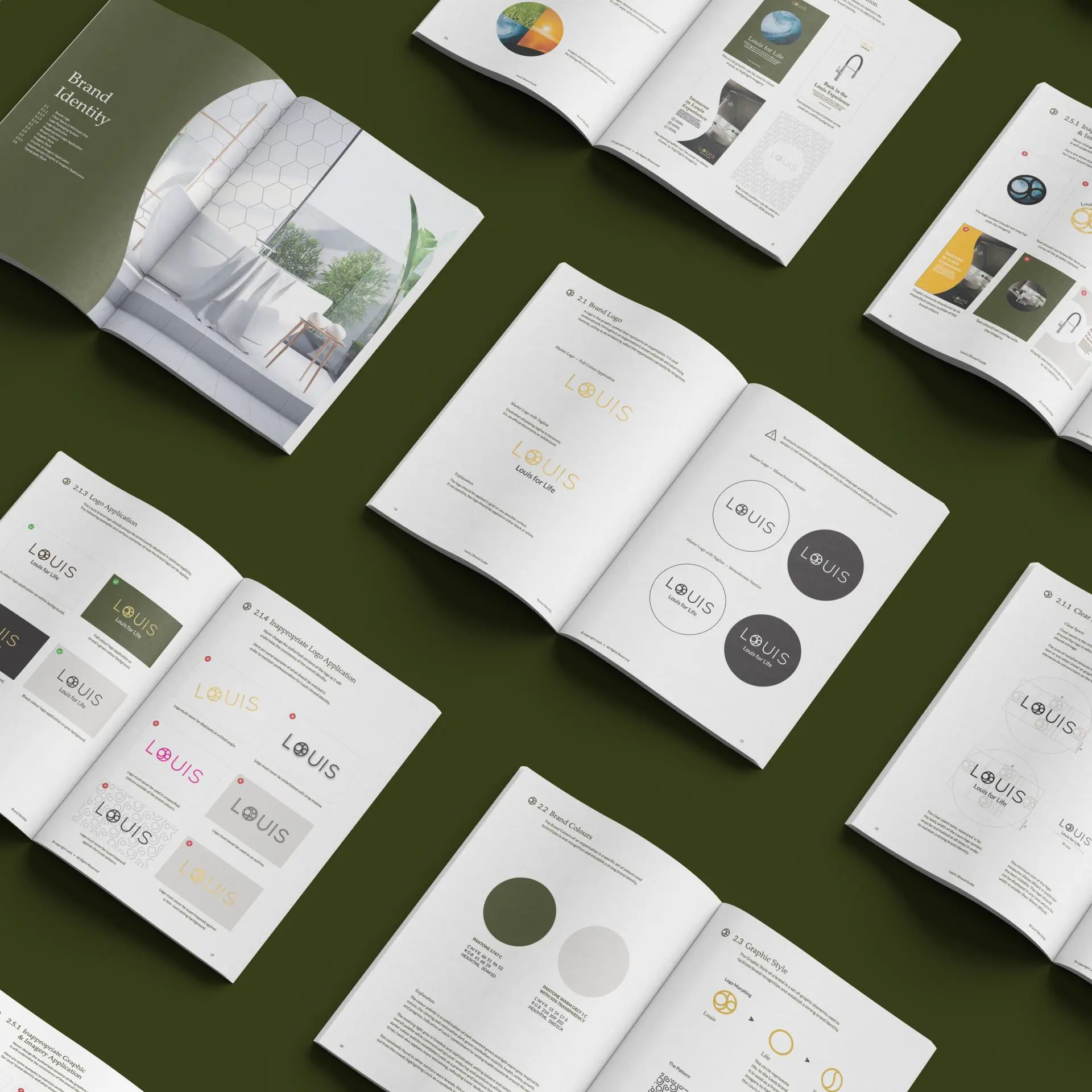
The graphic style is a direct adaptation of the brand's logo to establish a strong connection between the logo and the brand identity. Crafted with purpose and meaning, the logo symbol can be deconstructed into individual parts representing Louis’ brand essence and values. It can also be built into a seamless pattern to be used across Louis' touchpoints from packaging, catalogue to website, thereby maintaining strong brand recognition. Likewise, Louis' imagery includes images of bright, clean environments as well as nature to evoke feelings of hope and elegance.


BRAND TOUCHPOINTS
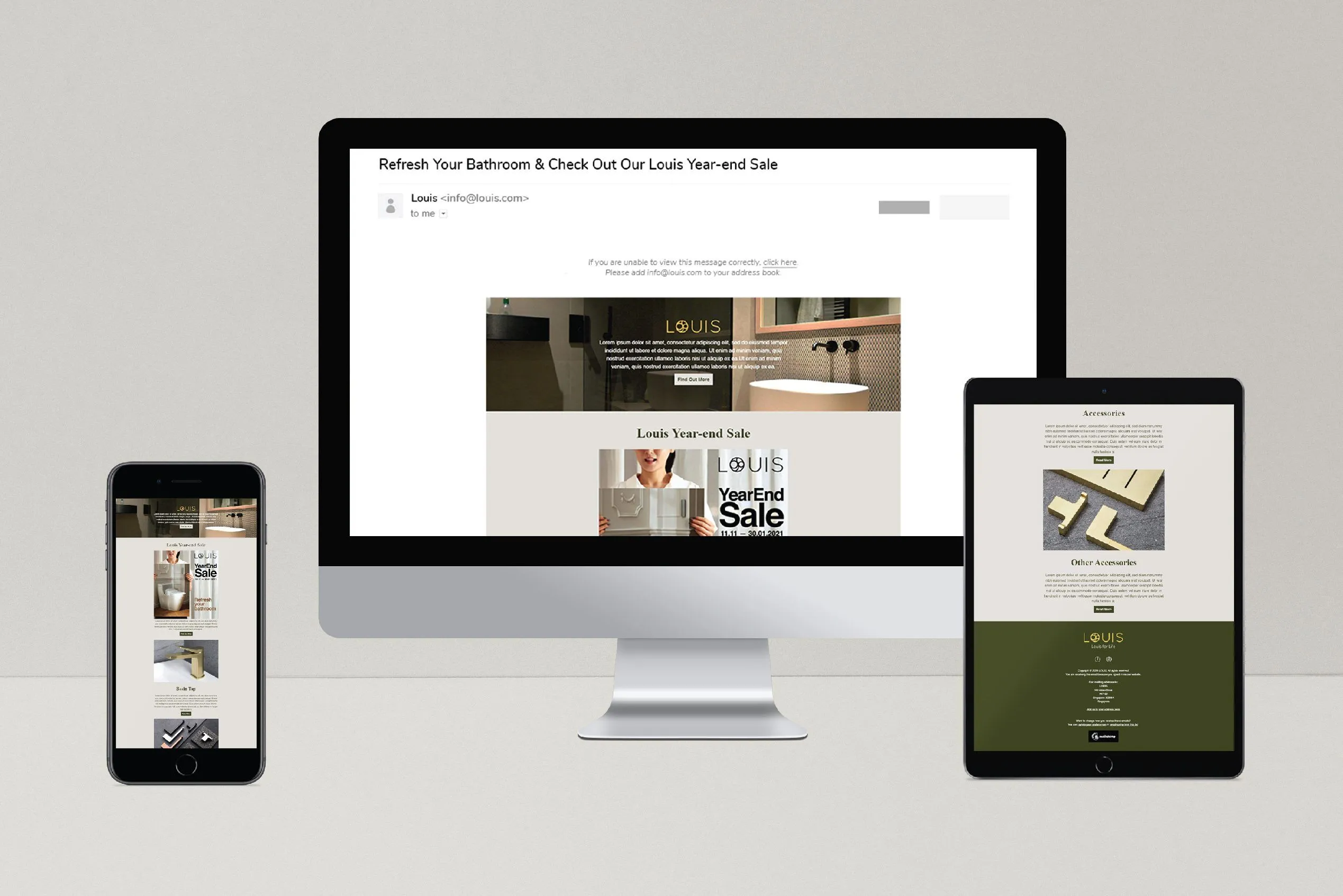
To reach Louis’ customers both online and offline, we developed a wide range of touchpoints that seamlessly incorporates Louis’s new brand positioning and identity. This includes a sales kit, catalogue, tote bag, brochures, website, and packaging.
These touchpoints serve as an important component in forming a harmonious and consistent brand experience for Louis’ customers. Combined with Louis’ new colour palette, the wide range of touchpoints demonstrates the versatility of the graphic style in conveying the brand’s message effectively.


"During the whole process of rebranding we are very happy that we have engaged Creativeans, they have been very professional, patient, flexible with changes & provide above & beyond customer service to us."


 Singapore
  Indonesia
  Italy
Italy