Rebranding FoodTech
Hoow Foods is a food-tech company that uses deep tech to provide healthy, tasty, and sustainable food ingredients and products to the F&B industry. This rebranding highlights Hoow Foods' expertise as a functional brand and its technical and scientific know-how.
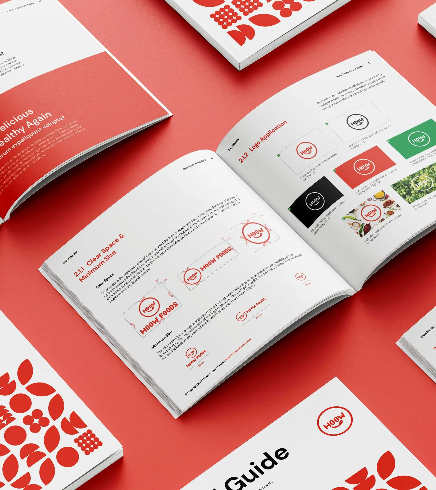
Hoow Foods' logo incorporates a smiley to communicate joy, happiness, and positivity. A cheeky tongue is added to create consistency with Hoow Foods' established ice-cream brand, Callery's. On top of that, it amplifies Hoow Foods' dedication to making healthier food that is also tasty. This is also portrayed across Hoow Foods' full suite of products and services, including its logo, colour palette, key visuals, imagery, and website design.
THE CREATIVE CHALLENGE
- Clients and customers perceived Hoow Foods as an F&B service provider instead of a food-tech company.
- Customers were confused by the business model and offerings of Hoow Foods as the food-tech industry was a relatively new concept in Singapore.
- Hoow Foods mainly was perceived just as an ice-cream company due to their product brand Callery’s success, which overshadowed their versatility in creating other functional ingredients and sustainable products.
THE OUTCOMES
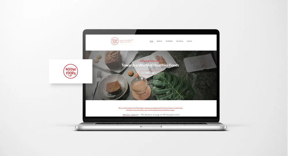
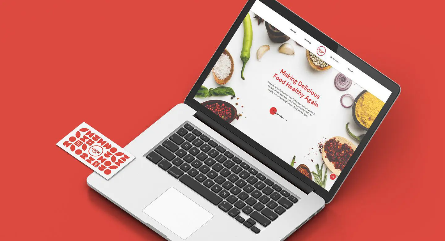
- The new brand identity and brand story changed customers’ perception of Hoow Foods from an F&B service provider to a food-tech company and educated them on their products and services.
- Hoow Foods’ touchpoints with its newly incorporated positioning and identity conveys the brand’s scientific know-how and innovative food solutions effectively.
- With a distinctive brand position and systemic brand architecture in place, Hoow Foods established itself as a credible corporate brand. They gained more brand recognition and trust amongst their target audience.
BRAND POSITIONING
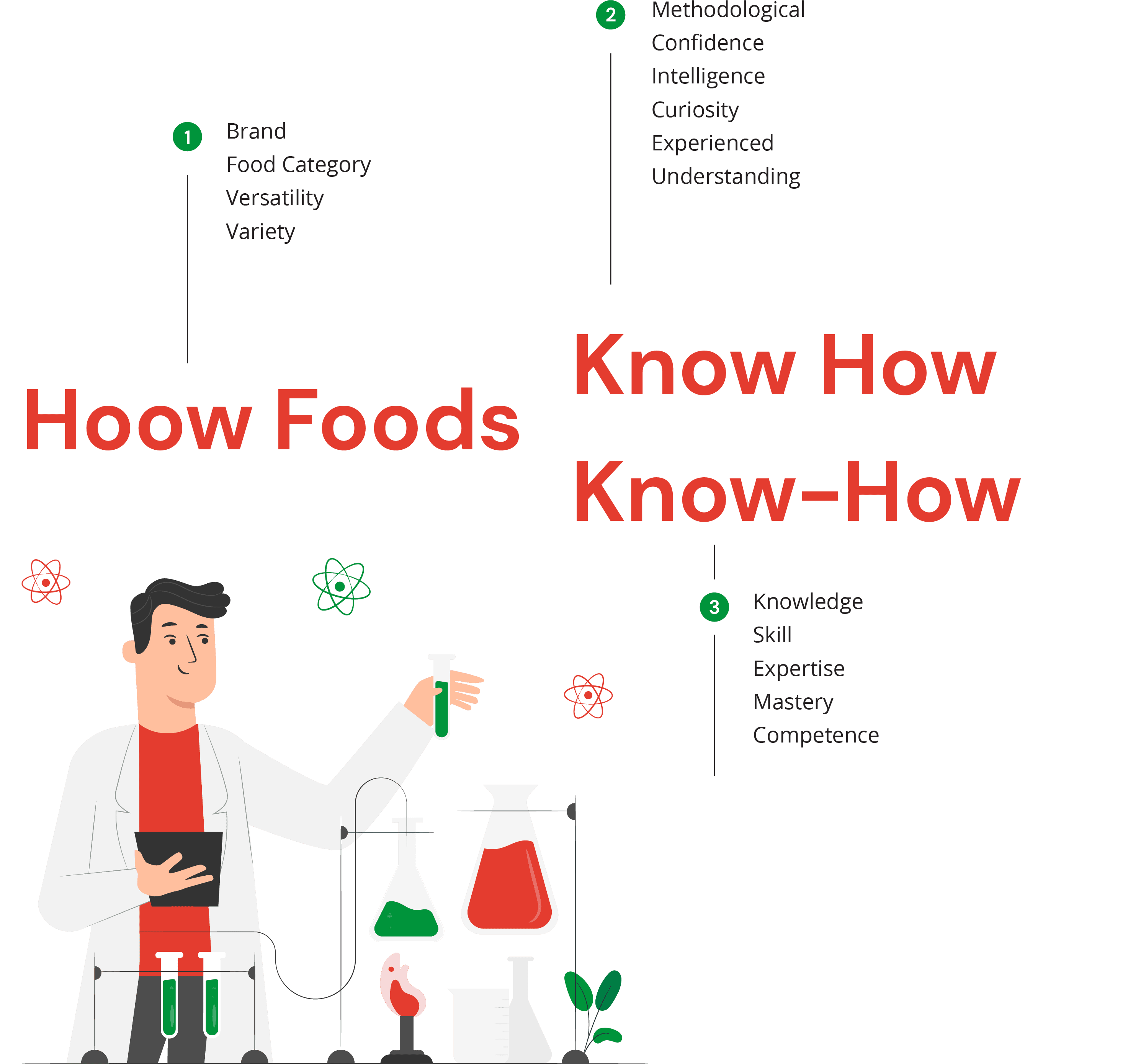
Hoow Foods' new brand essence, 'Hoow Foods Know How', captures their technical and scientific expertise in innovating and providing smart food solutions to meet society's changing needs and demands. The brand essence is brought to life with the Creator tone of voice to reflect Hoow Foods as an energetic and professional brand with the knowledge to amplify health and sustainability through food science and deep tech.

BRAND IDENTITY
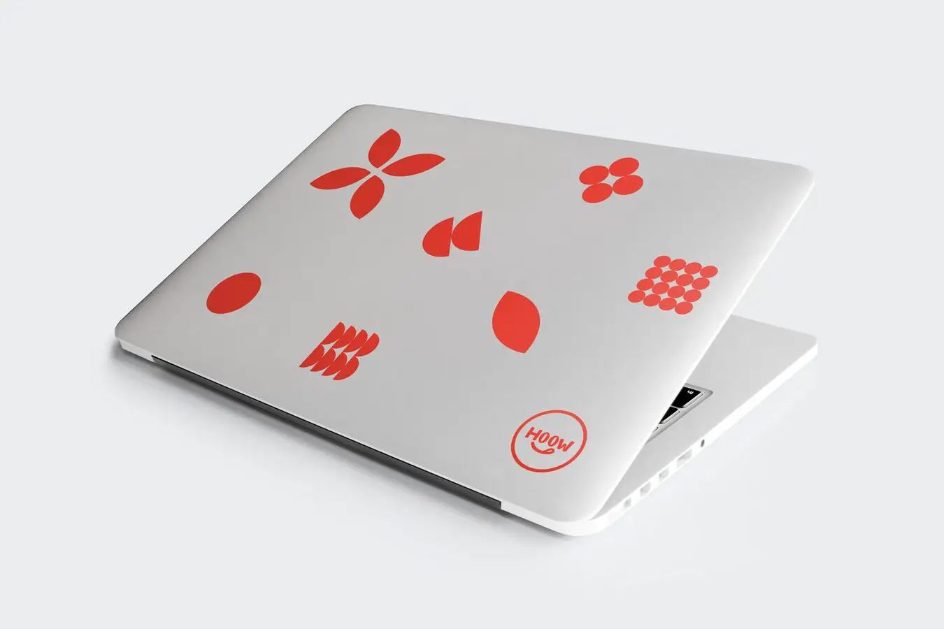
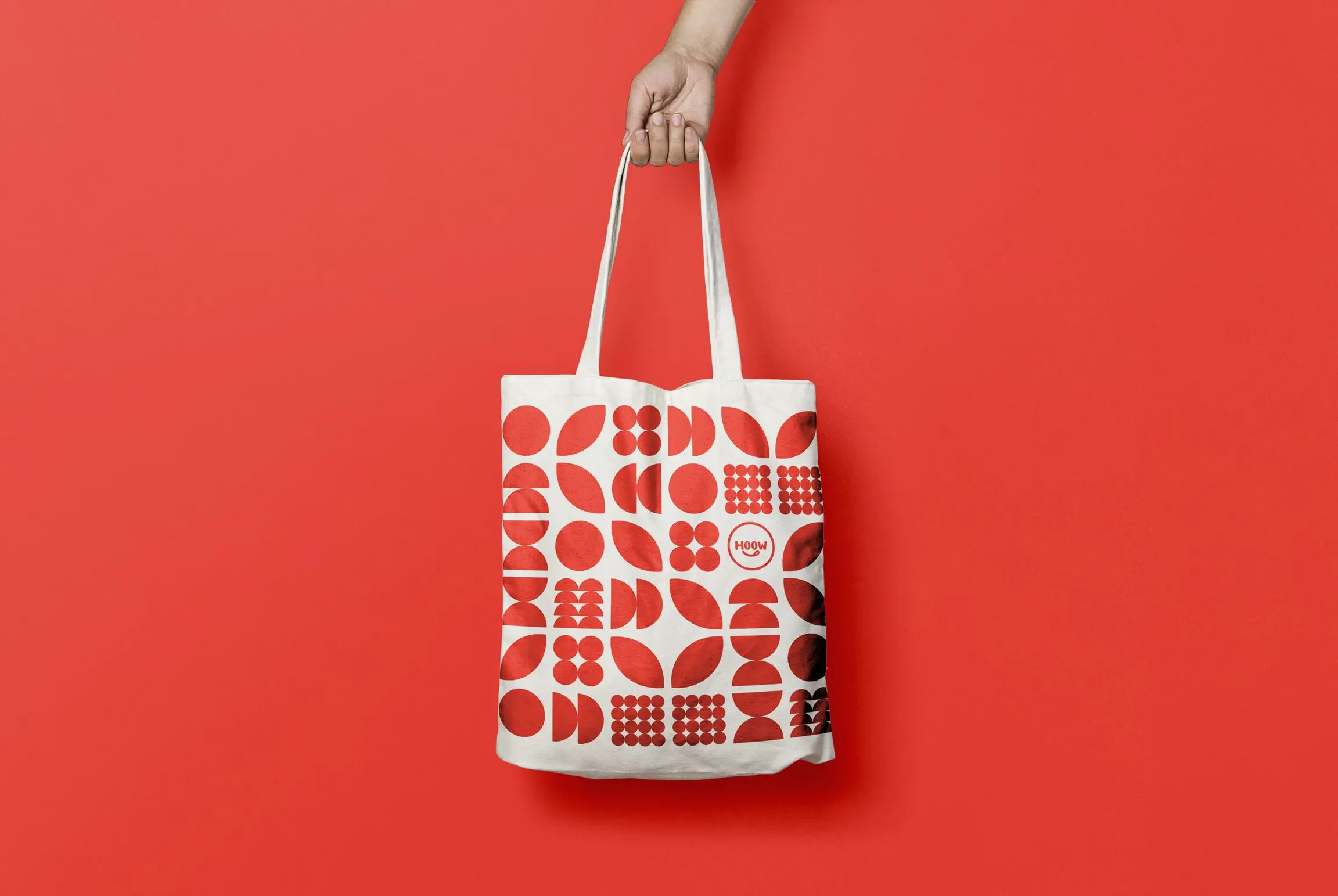
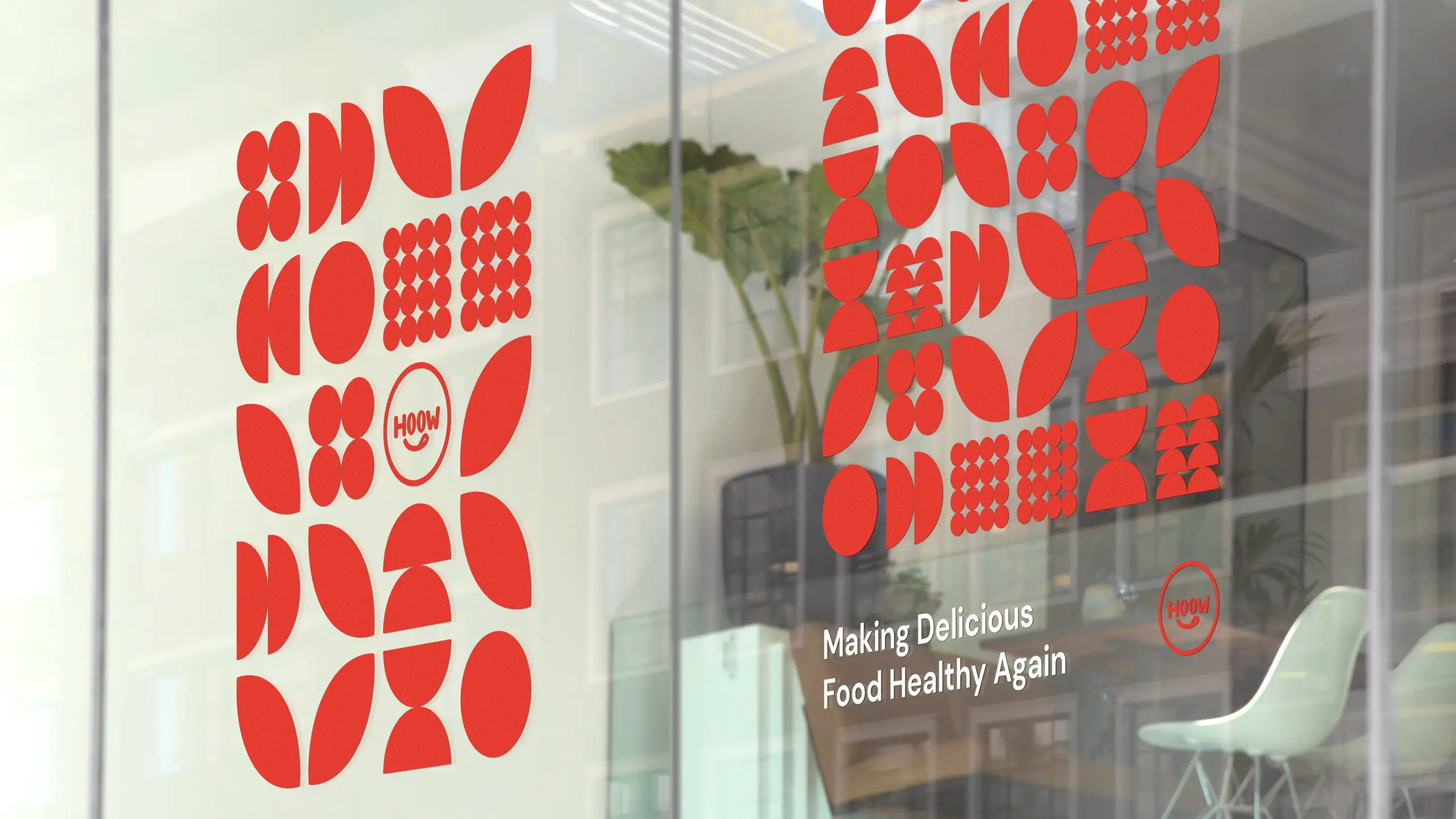
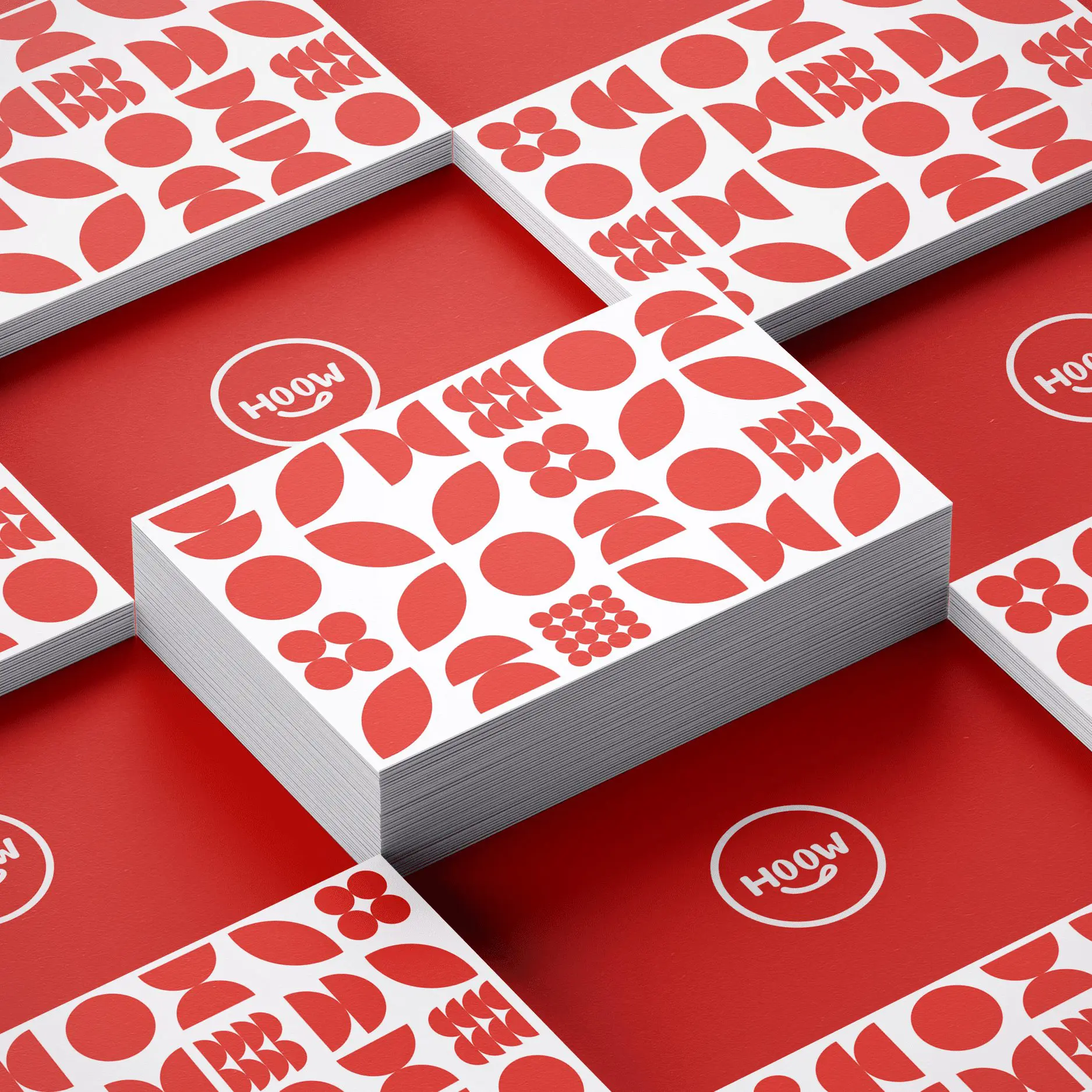
Much like building blocks of life, the geometrical shapes also serve as a versatile base that can be translated into graphic elements and a pattern that can be applied across many different mediums from corporate stationery, marketing collateral to its website UI/UX design. This focuses Hoow Foods’ repeatable science and vast impact on making the world a healthier and more sustainable place.

BRAND TOUCHPOINTS
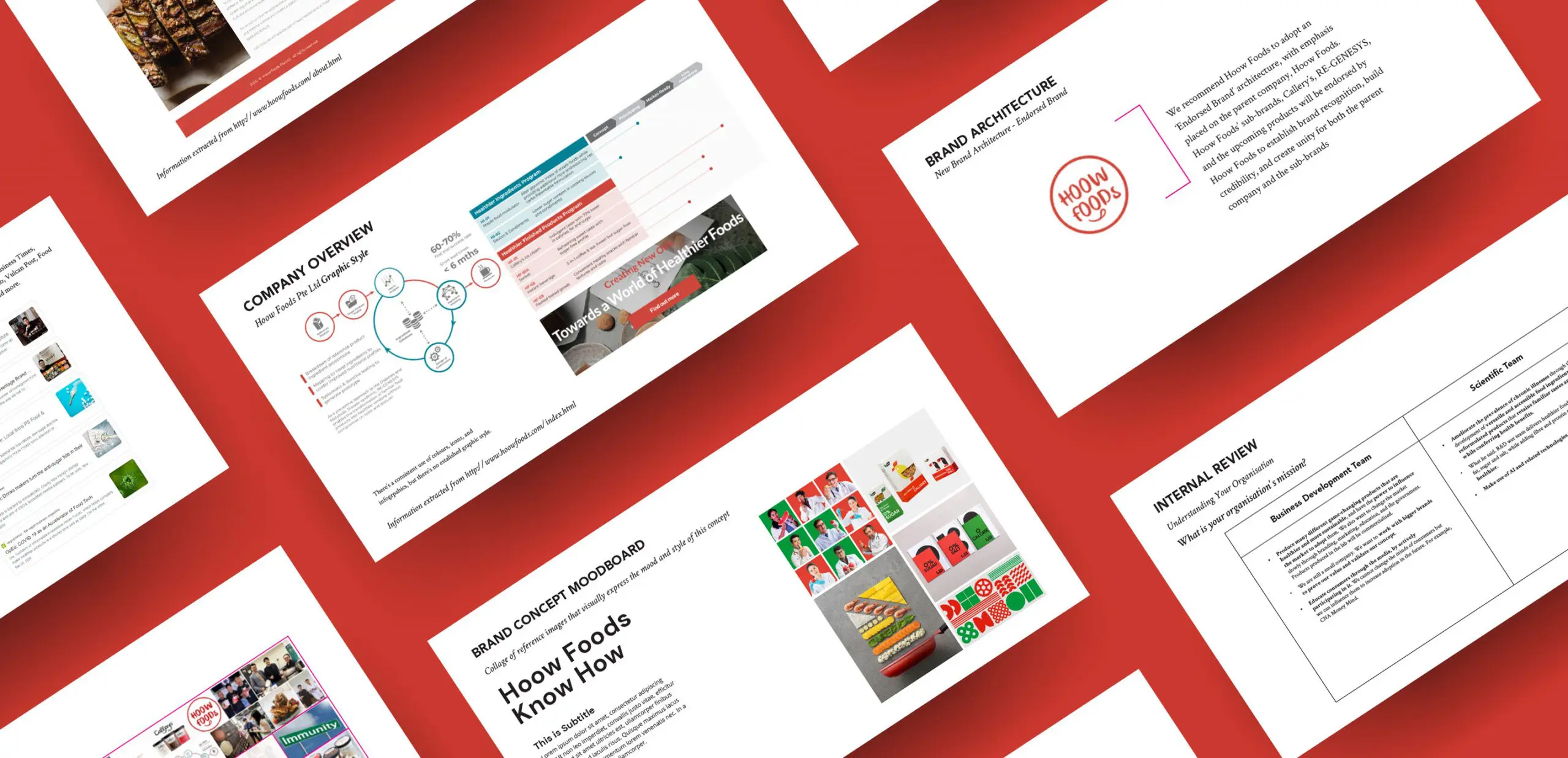
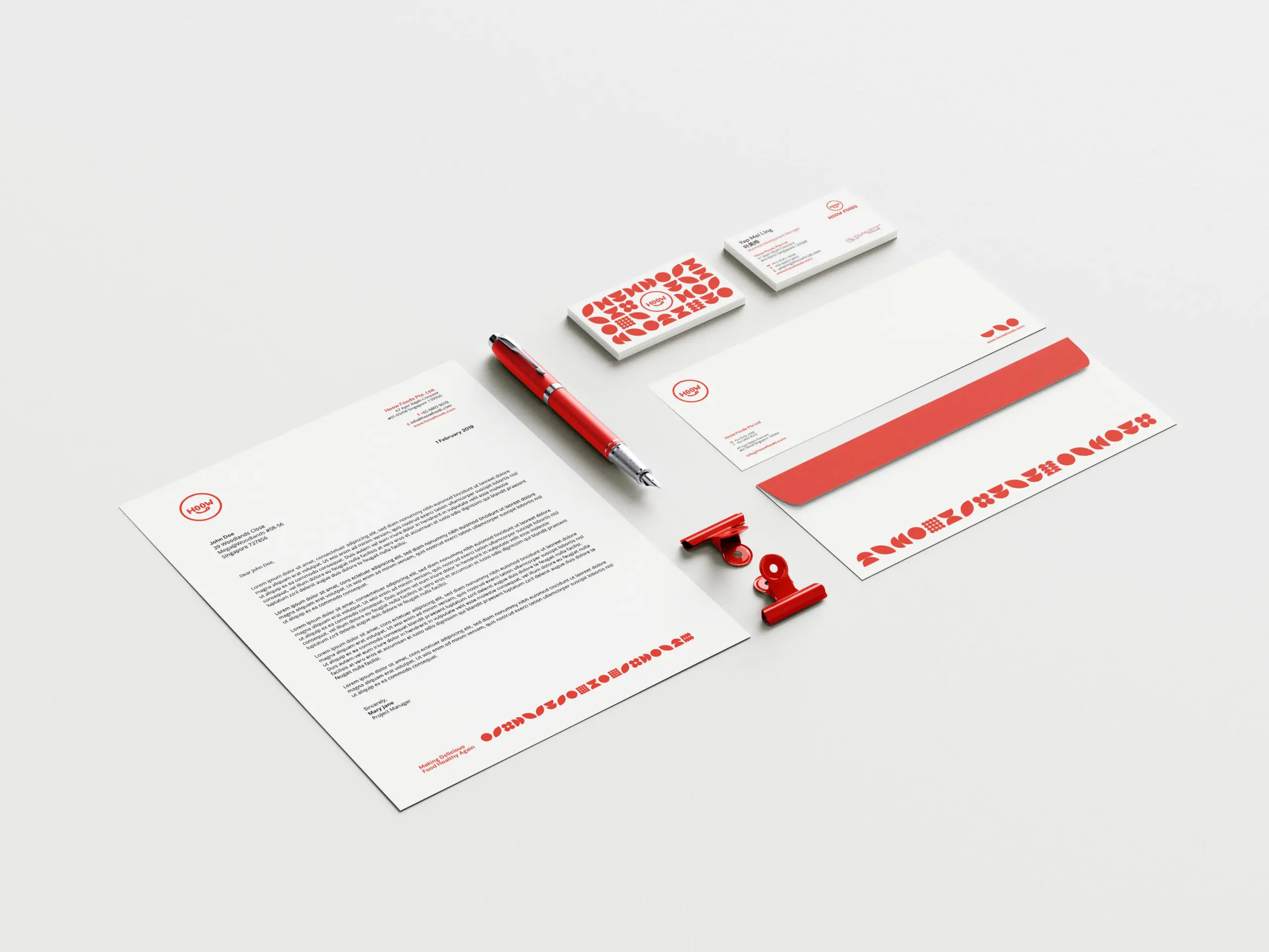
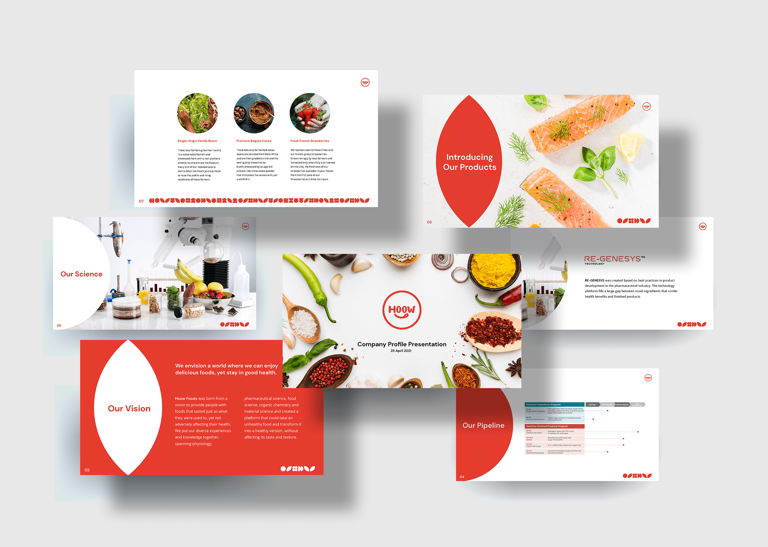
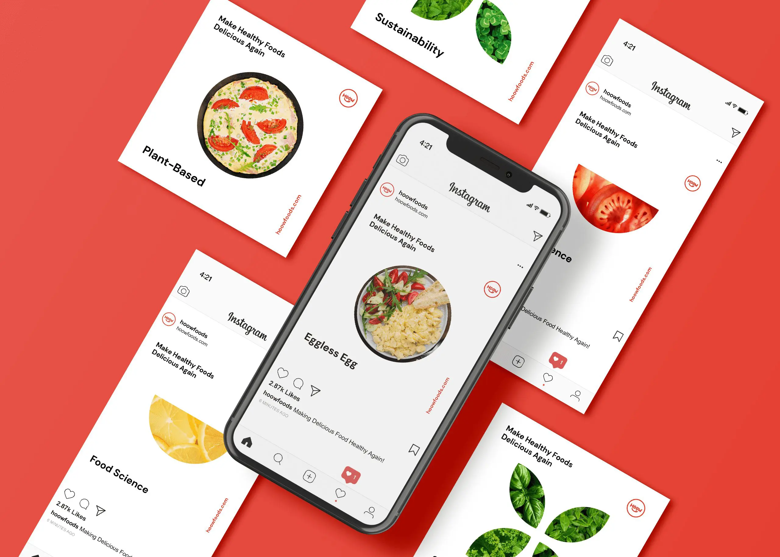
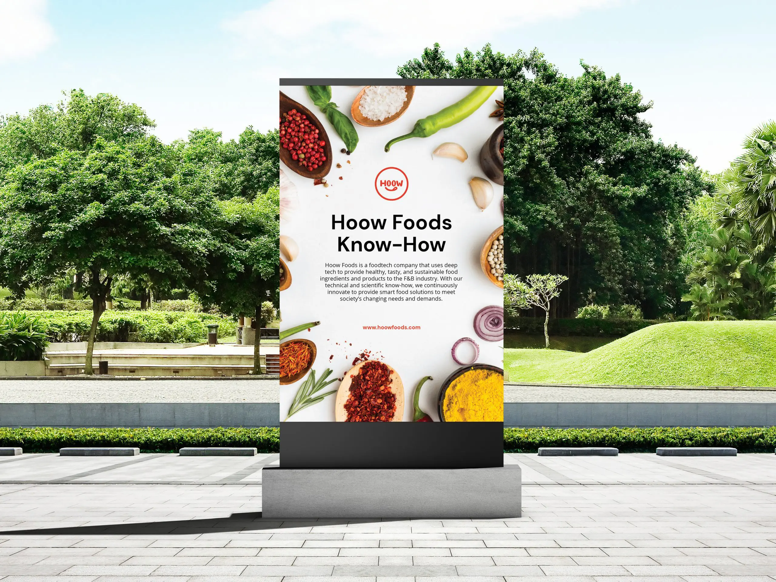
To reach Hoow Foods’ customers online and offline, we developed a wide range of touchpoints that seamlessly incorporates Hoow Foods’ new brand positioning and identity. This includes business cards, envelopes, letterheads, brochures, PowerPoint slides, website, and more.
These touchpoints are essential in forming a unified and consistent brand experience for Hoow Foods’ customers. Combined with Hoow Foods’ new colour palette and graphic identity, the wide range of touchpoints demonstrates the versatility of the graphic style in conveying the brand’s message effectively.

"The branding of Hoow Foods repositions them from a food manufacturer to a foodtech company that is at the forefront of this emerging industry. "



 Singapore
  Indonesia
  Italy
Italy