fbpx

Chic and Timeless: Hoola Hoola's Leather Handbag Branding Story

Italian Handbags

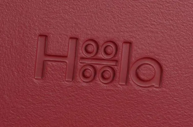
Designed in Venice, Italy, in a beautiful town near “the city of love”, Hoola Hoola handbags are crafted from a special resin and can easily be modified with a range of adornments. From luxe leathers and fabulous furs to glittering metallics, every bag becomes an extension of you and your wild imagination. We were tasked to develop the brand story and brand identity for Hoola Hoola so it can express its positioning, values and personality with clarity and impact to both external and internal stakeholders.
BRAND ESSENCE
The brand essence, 'I Feel Hoola Hoola,' establishes Hoola Hoola as a platform for self-expression. Each unique Hoola Hoola product takes on a set of emotions/personalities that customers can relate and identify with. Hoola Hoola represents the spectrum of emotions and personalities that the user wishes to express. Customers who don’t wish to settle with a single design can collect different bag components, each time creating a unique combination, depending on how they feel that particular day.
BRAND IDENTITY
The primary typeface for Hoola Hoola is Gentium, a Unicode serif typeface family, designed to be highly readable, reasonably compact, and visually attractive. The font family comes in Basic, Book Basic and Alt, each with Regular and Bold weights with matching obliques. The secondary typeface used is Quattrocento Sans, a classic, elegant & sober sans-serif typeface, designed to be warm, readable and not intrusive. The font family comes in Regular and Bold weights, each with matching obliques. The third supporting typeface used is Notera, a sans-serif typeface designed to look like handwritten text. It is used as a supporting typeface that helps to add a personal touch to the designs. The color scheme of the brand is light and neutral so as to form a contrast against the bright colors of the products. The warm shades of grey help create an ambience of calm while retaining the qualities of class and elegance. The Graphic Style of Hoola Hoola utilises diagonal, horizontal and vertical dissections within the designs in order to highlight the differences and similarities between the subjects featured in the images. This can also be applied to supporting graphics.
BRAND TOUCH POINTS

A comprehensive brand guide that includes brand story, logo usage, visual styles, colour palette, tone of voice to application samples is produced to provide guidance in communicating Hoola Hoola’s brand accurately and consistency. We also provided art direction for the brand’s product photoshoot, as well as designed the various brand touchpoints which includes the envelope, poster ad, as well as its website.

"We had some very helpful insights into how to shape our brand and products. They provided valuable input and advice on various aspects beyond their scope of work. Ultimately, they gave us a clear direction into brand development, making the brand more focused on its strengths and we feel now better positioned to move ahead with what we initially started. If we could go back in time, we would have engaged them at an even earlier stage."

Antonio Miscellaneo
Founder, Hoola Hoola
Join the 226 businesses and collaborators that have improved their business impact.
THE PROJECT MATTERS

We are an award-winning brand and design consultancy. We partner with brands to create projects that matter.

PLAY IDEA DICE

Developed by Creativeans, the Idea Dice helps you through the design thinking process as well as problem-solving.

Business Enquiry
info@creativeans.com
Career / Internship
collaborate@creativeans.com

Creativeans is an award-winning brand and design consultancy based in Singapore, Milan and Jakarta. We build brands that matter.

ISO 9001:2015 Singapore Certified Consultancy © 2024 Creativeans Pte Ltd. All Rights Reserved