BRAND AUDIT
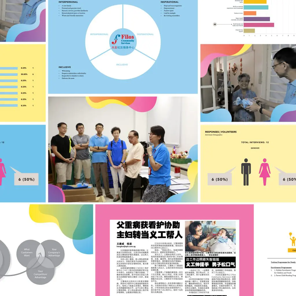
Filos Community Services is a not-for-profit social service organisation. Focusing on building the strengths of the community we live in, they work towards empowering individuals and families to live a more fulfilling, meaningful and happier lives. Tasked with a complete rebranding of Filos, we conducted a comprehensive brand audit to reposition them to be highly relational by enhancing and emphasizing the emotional components of its brand, people and services. Filos’ existing logo had been refined to create a cleaner and more balanced form for use across different mediums and sizes. The modified logotype uses a more contemporary serif typeface that retains its humanistic and friendly touch while maintaining a bold and firm expression. It also communicates the symbolic meaning of the original logo within the brand name itself.

BRAND MANUAL

BRAND IDENTITY


BRAND TOUCH POINTS
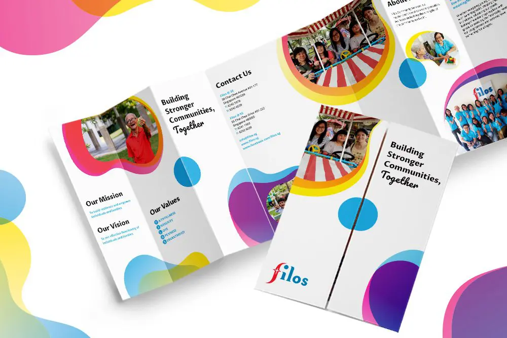
We developed thoughtful touches throughout Filos’ various touchpoints, ranging from corporate stationery, physical and digital marketing collateral, website to video production in congruent with the new brand identity to maintain a consistent brand message and experience that inspire.


“We have implemented a new brand identity to our corporate stationeries, premise, website, marketing collateral and social media channels. We have seen increased brand awareness and now have a strong differentiation factor from others. We are happy now that our referrals have increased, more youths joining Filos as volunteers and we have attracted more corporate partners coming in to support our programmes.”


 Singapore
  Indonesia
  Italy
Italy