fbpx

Redefining Industry Standards: The Entrepot Branding Journey

Branding An Industrial Equipment Company

Established in 1984, Entrepot is a leading provider of industrial equipment and services in Singapore. Building on the brand's original vision, encapsulated in 'Our Quality Package,' we've positioned Entrepot as an experiential brand, offering a range of pre and after-sales services for a distinctive customer experience. Supported by knowledgeable and dedicated salespeople, Entrepot goes beyond its reputation for quality products. Considering this, we formulated the new brand essence, "The Complete Package," embodying Entrepot's distinctive end-to-end experience for customers, differentiating it in the market.

THE CREATIVE CHALLENGE
  • Without a cohesive brand narrative and identity, Entrepot faced challenges in clearly conveying the value of its services to potential clients and establishing brand-customer relationships.
  • Due to inconsistent graphic style, imagery, typography, tone of voice, and brand colors, Entrepot finds it challenging to differentiate itself from competitors in the industry.
  • The disorganised and non-responsive website creates inconvenience for users, hindering their ability to navigate and find what Entrepot has to offer.
color photo black and white
THE OUTCOME
  • The transformation in brand narrative and identity enabled Entrepot to effectively communicate the value of their services, establishing stronger brand-customer relationships.
  • The cohesive and polished brand identity enhanced their visibility and appeal, contributing to a stronger market position.
  • The streamlined revamped website facilitates easy access to information, allowing users to efficiently find what Entrepot has to offer.
LOGO DESIGN
The new logo is rooted in Entrepot's brand essence, embodying 'The Complete Package.' The incorporation of a checkmark symbol visually signifies the comprehensiveness of Entrepot's range of products and services. Placed within the letter 'e,' it forms a distinctive wordmark, enhancing brand recognition, even when reduced to its symbol alone. The use of a sans-serif font with sharp edges communicates the brand's professionalism while retaining the friendly and human aspect of Entrepot through subtle curved details in the logo. The minimalist design of this logo concept gives a contemporary touch to the brand, contributing to the overall balance of Entrepot's brand identity and providing the differentiation needed in its competitive landscape.
BRAND IDENTITY
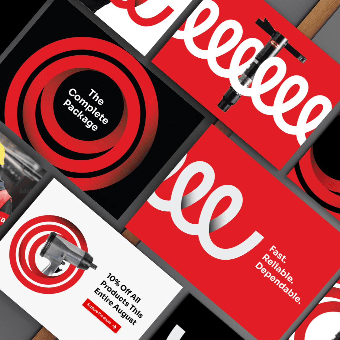
At the heart of the brand identity lies the symbolism of a spring, epitomising Entrepot's unwavering commitment to swiftly elevate customers' work quality—much like the rapid rebound of a spring. Beyond this emblematic representation, the spring imagery underscores the brand's capacity to assist customers in overcoming potential challenges, ensuring the seamless progression of their projects. This fortifies Entrepot's position as a reliable partner, emphasising a fundamental brand value. Within the graphic system, spring visuals take center stage, showcasing uniform loops and lines that artfully mirror Entrepot's diverse range of quality products and services. Adhering to the established colour scheme of red, black, and grey maintains familiarity with existing customers. The overall concept seamlessly combines straightforward lines with a clean typeface, resulting in an inviting and accessible visual identity.
BRAND TOUCHPOINTS

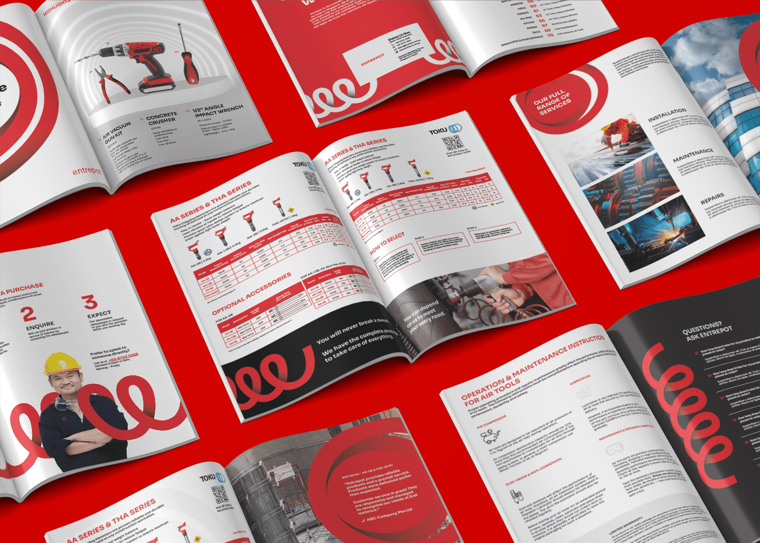
We systematically integrated key elements across multiple aspects of Entrepot, including the website, electronic direct mailer templates, notepads, corporate stationery, and corporate uniforms. This integration was executed in alignment with the new brand identity, ensuring a unified brand message and user experience.

"Entrepot's transformation in brand narrative and identity enabled the brand to effectively communicate the value of their services, reflecting the brand's position as the top industrial equipment company."


Kimming Yap
Managing Director, Creativeans
Join the 226 businesses and collaborators that have improved their business impact.
THE PROJECT MATTERS

We are an award-winning brand and design consultancy. We partner with brands to create projects that matter.

PLAY IDEA DICE

Developed by Creativeans, the Idea Dice helps you through the design thinking process as well as problem-solving.

Business Enquiry
info@creativeans.com
Career / Internship
collaborate@creativeans.com

Creativeans is an award-winning brand and design consultancy based in Singapore, Milan and Jakarta. We build brands that matter.

Singapore Registered Management Consultant © 2025 Creativeans Pte Ltd. All Rights Reserved