REBRANDING SHOTS BAR
Chupitos is a Singapore-based bar and restaurant that celebrates bold flavours and spreads the free-spirited message of fun and friendship. Located in the heart of Clarke Quay, Chupitos offers a unique drinking and dining experience that is unlike any other, and with them, it’s always a good time.
The new logo takes on a fluid form through the use of organic and squiggly shapes, conveying how Chupitos is a place where people go to have fun and ‘get high.’
The loose representation of each letter in varying shape, size, and thickness also represents Chupitos as a freeing, quirky, and wild place, allowing the brand to leave an impression of not taking itself too seriously.
Overall, the logo wordmark is visually strong and bold, further cementing Chupitos as a fun-loving bar that is inherently unrestrained.
Chupitos is also the proud recipient of the Indigo Design Awards Silver in Branding for Branding for Restaurants / Cafe. View the award here.


THE CREATIVE CHALLENGE
- The lack of consistent brand identity made it difficult for Chupitos to stand out amongst its competitors in the market.
- Partygoers perceive Chupitos as a young bar, thus limiting their ability to reach out to a wider and more mature target audience.
- The previous brand identity portrays Chupitos as a drinking venue, which is unsuitable for a day-to-night concept restaurant bar.


THE OUTCOME
- Chupitos’s newly adopted brand identity effectively differentiates itself from its competitors, creating a stronger brand recall and impression in its market.
- The brand’s graphic style evoked a fun and cheeky vibe that aligns with the brand’s tagline “Go Wild For A While”
- The revamped on its space and environmental graphics highlight the experiential aspect of Chupitos, thereby making Chupitos a vibrant and fun space for exciting nightlife.
BRAND IDENTITY
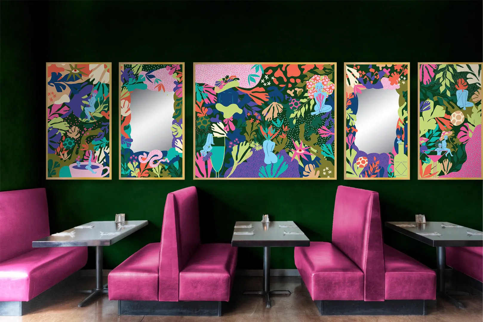
Chupitos’ refreshed brand identity introduces the unordinary to a tropical jungle. Inspired by Singapore as a tropical island, the jungle-themed concept acts as the backdrop for creating a playful, quirky, and colourful world. The key visuals use a unique illustrative style to create a series of applications in line with their tagline, Go Wild For A While.
The illustrations are made up of a variety of components and layers that can be found in an un-ordinary jungle. The jungle flowers, leaves and serpent sets the stage for a tropical vibe. At the same time, the organic patterns add depth and quirkiness to the environment. The naked humans and body parts reinforce the elements of bizarreness and surprise to create an overall exciting visual experience. These elements can be combined to form the key visual and implemented separately across the touch points, from menus and UI/UX design to environmental graphics. Coupled with the imagery style that communicates the authenticity of the ambience and people having fun in Chupitos, the visuals convey Chupitos’ ability to transport customers to an otherworldly destination that takes them away from their ordinary lives.


BRAND MANUAL
The purpose of a brand manual is to ensure that all brand elements are used consistently and correctly, helping to build a strong and recognizable brand identity. At the same time, it helps maintain a professional and polished image and can be a valuable asset in building brand awareness and recognition.
BRAND TOUCHPOINTS
To showcase Chupitos’ wild and fun-loving qualities, we have developed an umbrella of touchpoints, ranging from their marketing collaterals, menus, and website to their environmental graphics.
These touchpoints are essential in conveying the unique brand experience for Chupitos’ customers. Combined with Chupitos’ new colour palette and illustrative visual identity, the wide range of touchpoints demonstrates the versatility of the graphic style in conveying the brand’s message.


“The rebranding of Chupitos has successfully positioned this popular bar and restaurant as the go-to destination for partygoers to go wild for awhile.”


 Singapore
  Indonesia
  Italy
Italy