Redesigning Ice Cream
Callery’s Low-Calorie Ice Cream was born from a clear objective – to bring healthier desserts without compromising on taste and enjoyment. Healthy foods, especially desserts, have always had a reputation for tasting bad. Callery’s Ice-Cream, one of the World’s first Premium Reduced-Calorie Ice-cream was created to bring out the best of both worlds - Opulent Taste, Minimal Calories. By combining food science and safety with culinary arts, Callery's bring the world a truly unique gourmet product.

Brand Identity
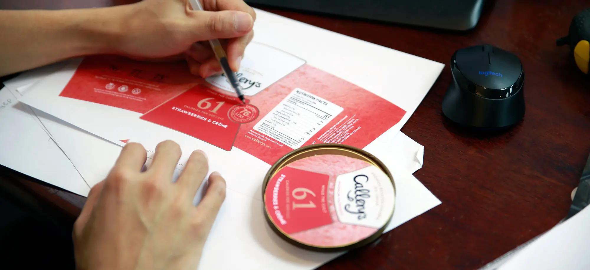
We were tasked to design Callery’s brand identity and ice cream packaging, communicating it as a rich yet healthier ice cream that you can indulge with Maximum Happiness, Minus the Guilt.


Logo Design

PACKAGING DESIGN
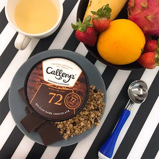
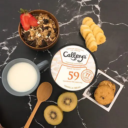
Callery’s packaging designs feature high-quality close up of its ice cream flavours. These imagery, coupled with distinctively coloured labelling help consumers easily identify between flavours and recognise the brand on the market shelf. Simple, clear and concise, the strong imagery style, typography and graphics facilitate easy understanding of the product values, reinforcing its transparency and honesty in what the Callery’s brand offers.


"This Singaporean low calorie ice cream tastes just as good as regular ice cream."


 Singapore
  Indonesia
  Italy
Italy