Building Blue Aqua’s Brand Identity
for Sustainable Aquaculture Solutions
{ Project Overview }
Blue Aqua believes that food has the power to change the world, and its purpose is to feed and sustain the future safely and sustainably. Born from the belief in the symbiosis of Earth and humankind, the brand champions aquaculture solutions that support food security while protecting nature for future generations.
Through the brand identity refresh, we translated Blue Aqua’s purpose, “Sustain Our Future,” into a visual and verbal system that reflects its role as an aquaculture expert, farmer, educator, and sustainability advocate. The result is a brand identity that balances professionalism with warmth, helping Blue Aqua communicate its global expertise, human touch, and commitment to building a better future for food.
{ Creative Challenge }
- 01
With multiple business units and product categories, the brand needed a more organised system to explain its solutions clearly.
- 02
It also had to balance scientific credibility with warmth, so it could connect with farmers, customers, scientists, and communities.
- 03
Most importantly, its purpose, “Sustain Our Future,” needed to become a flexible identity system that could work across corporate, product, and digital touchpoints.
{ The Solution }
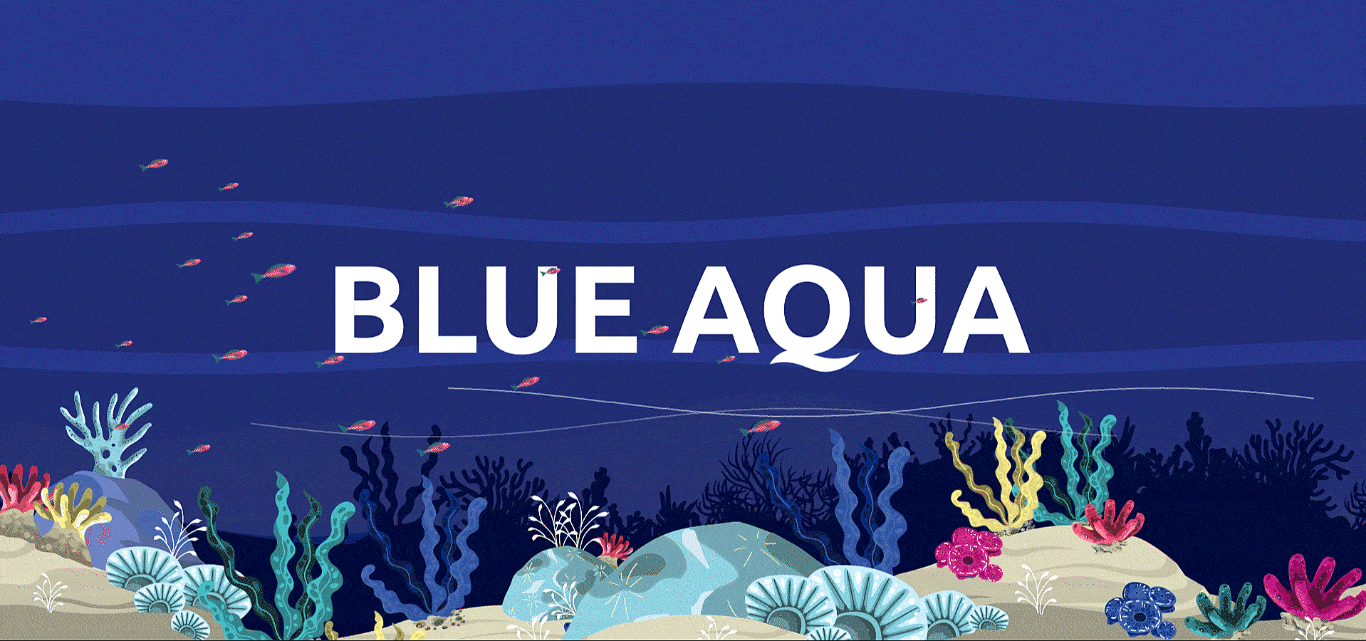
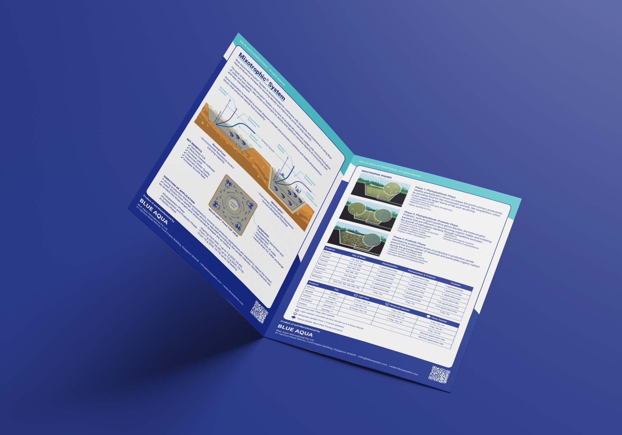
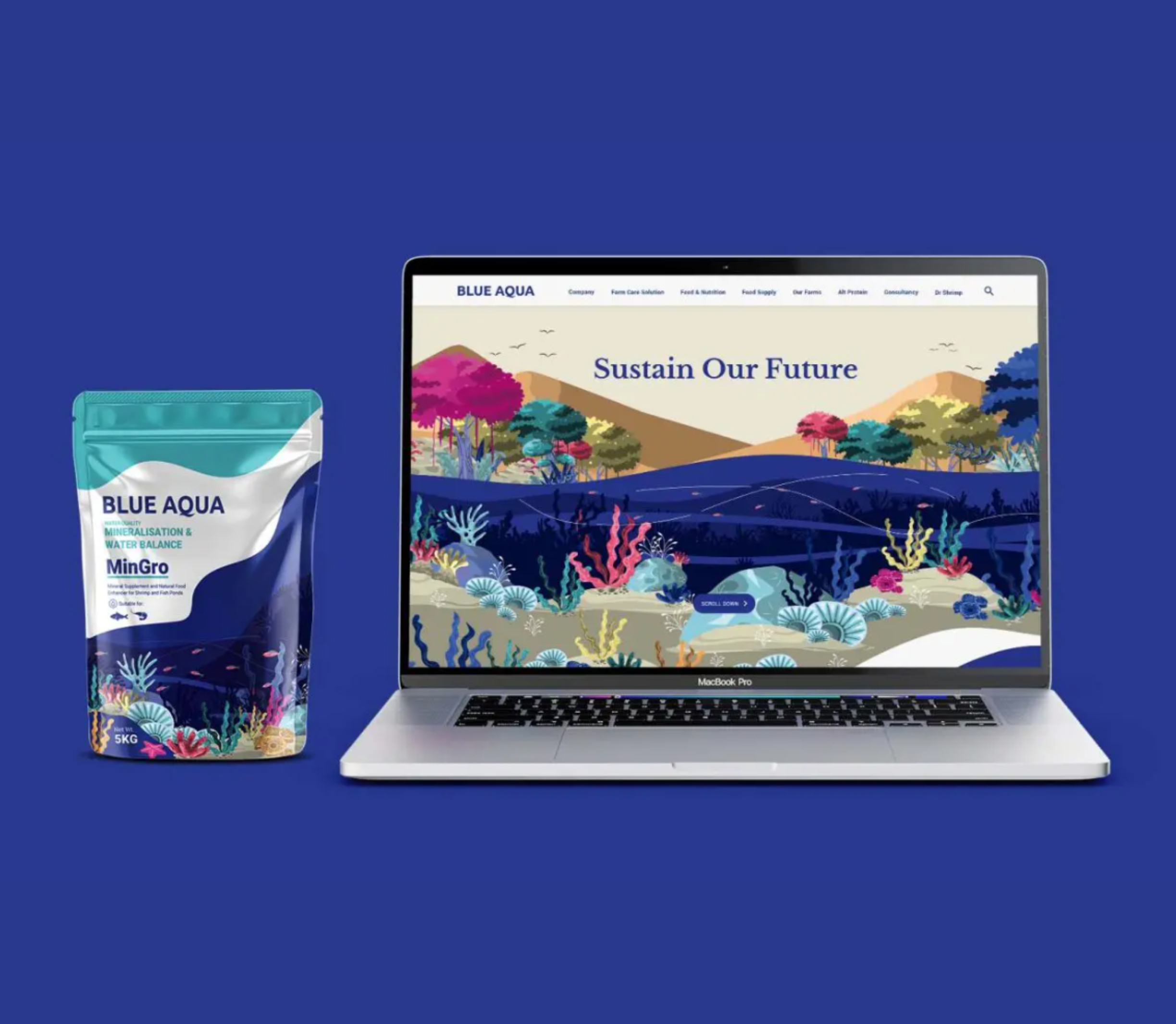
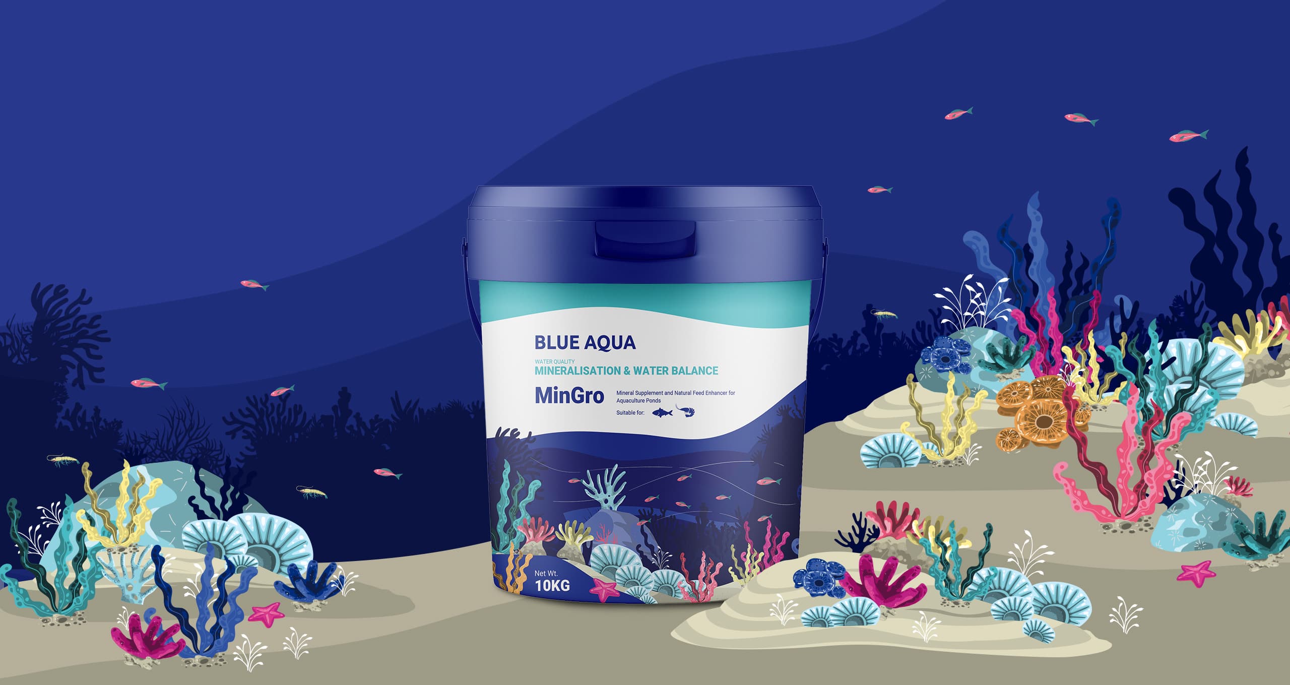
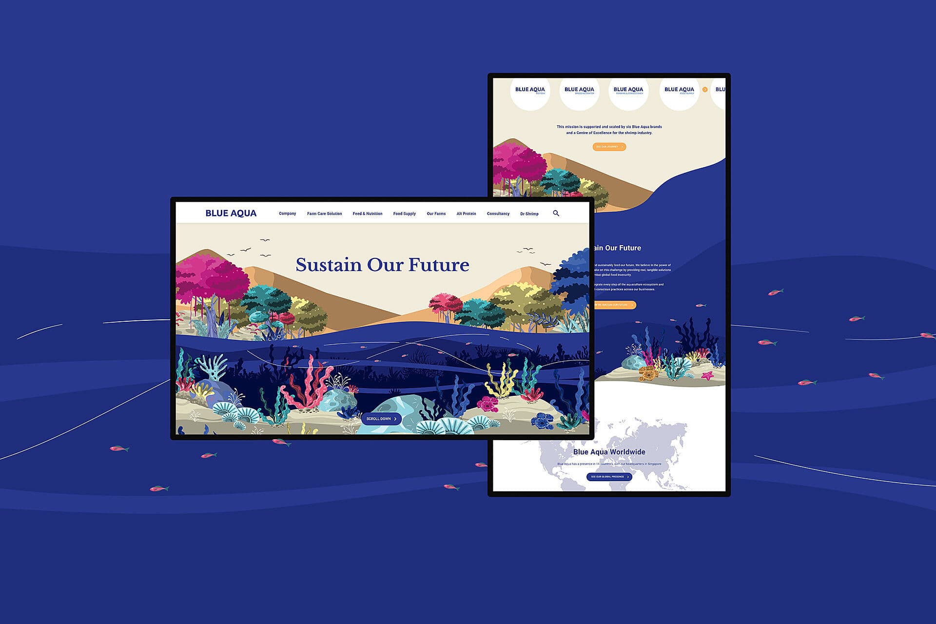
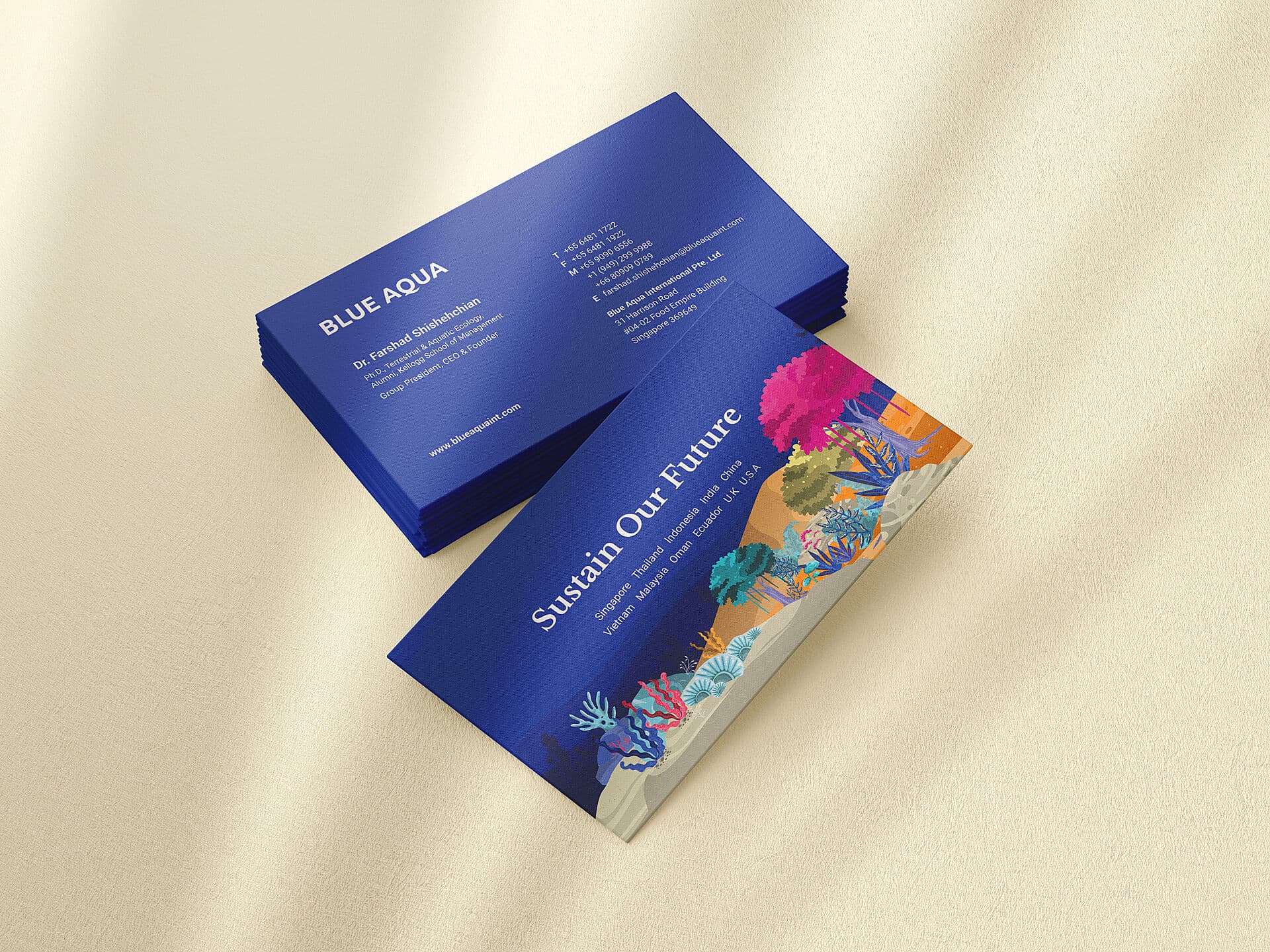
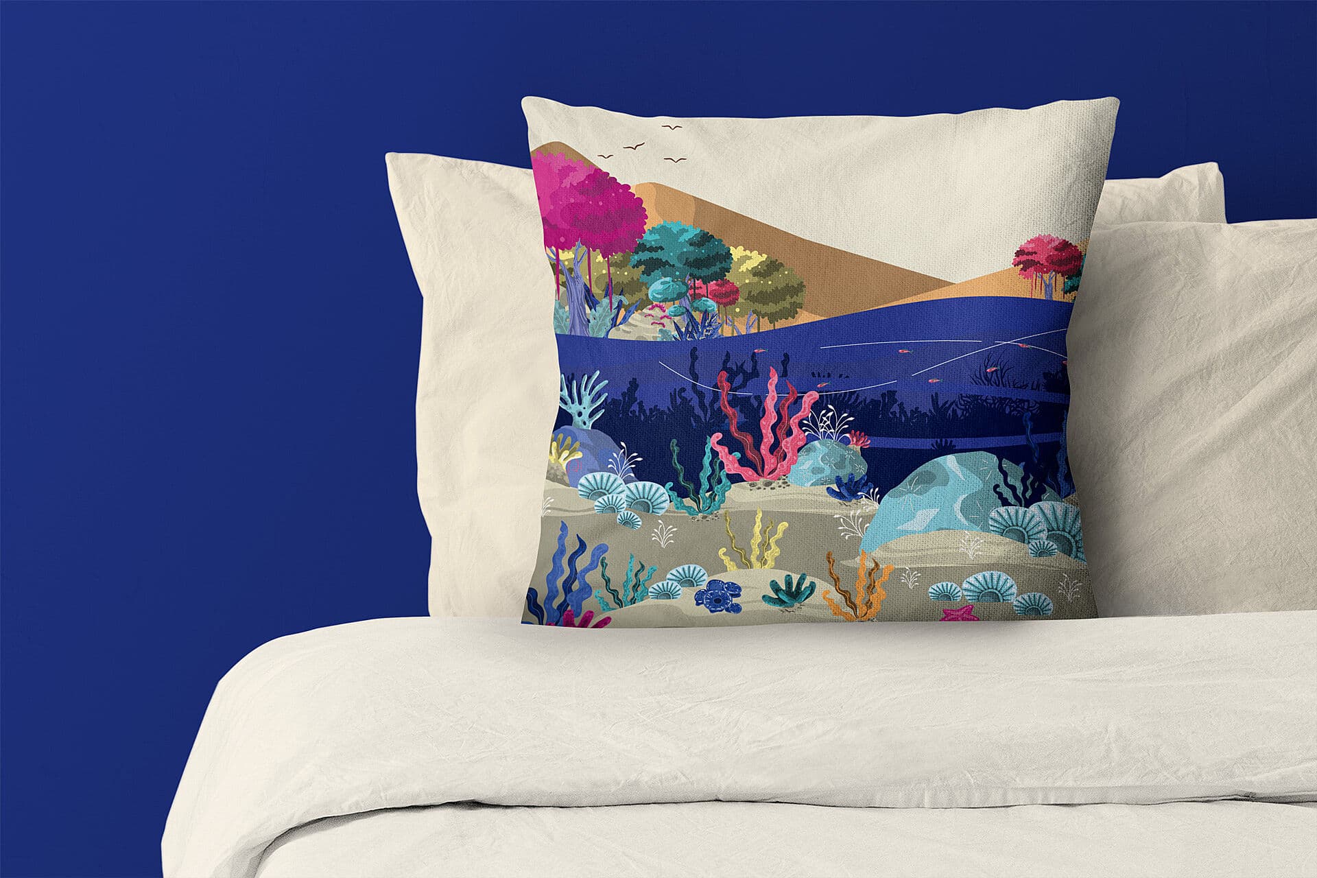
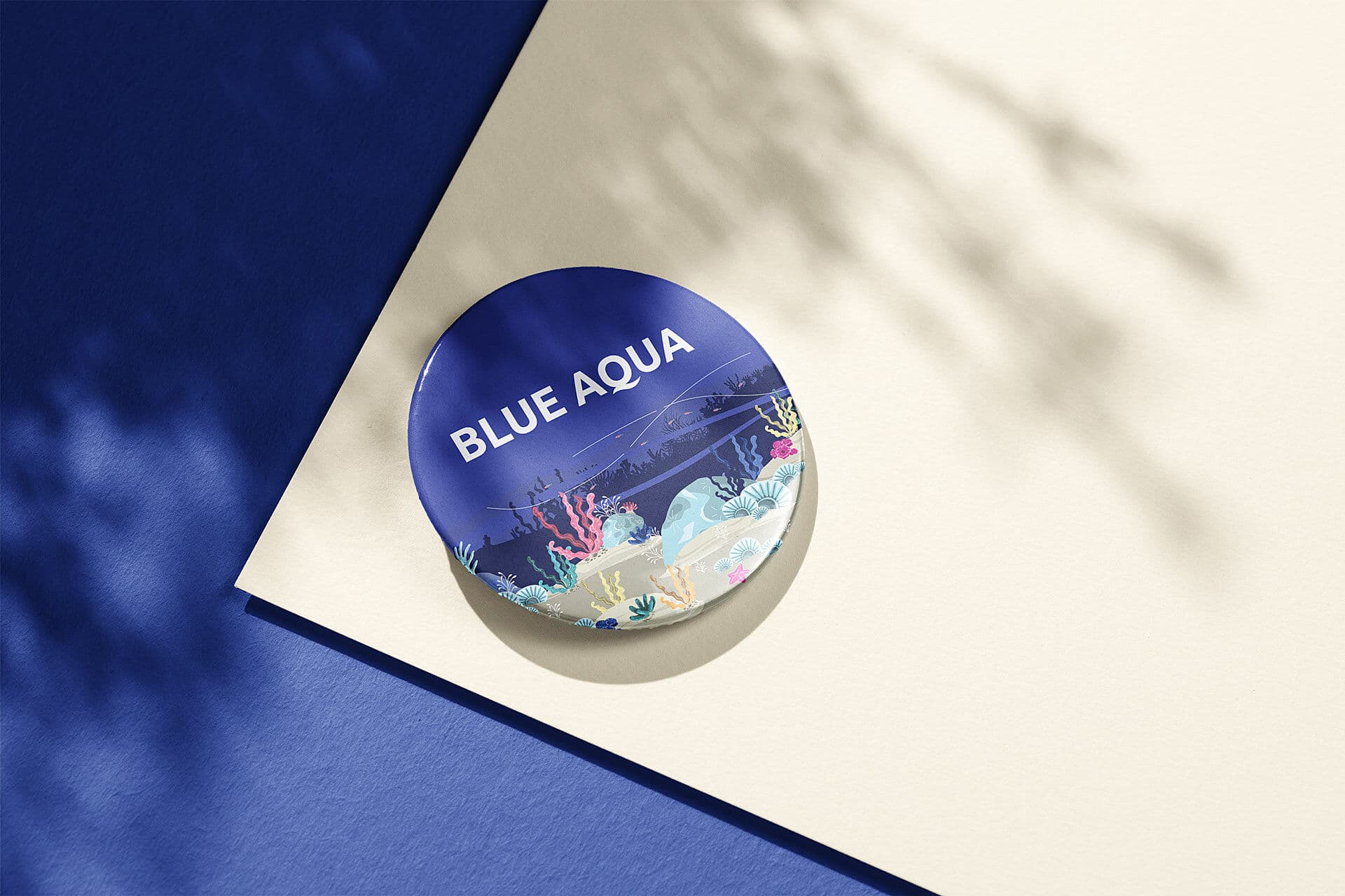
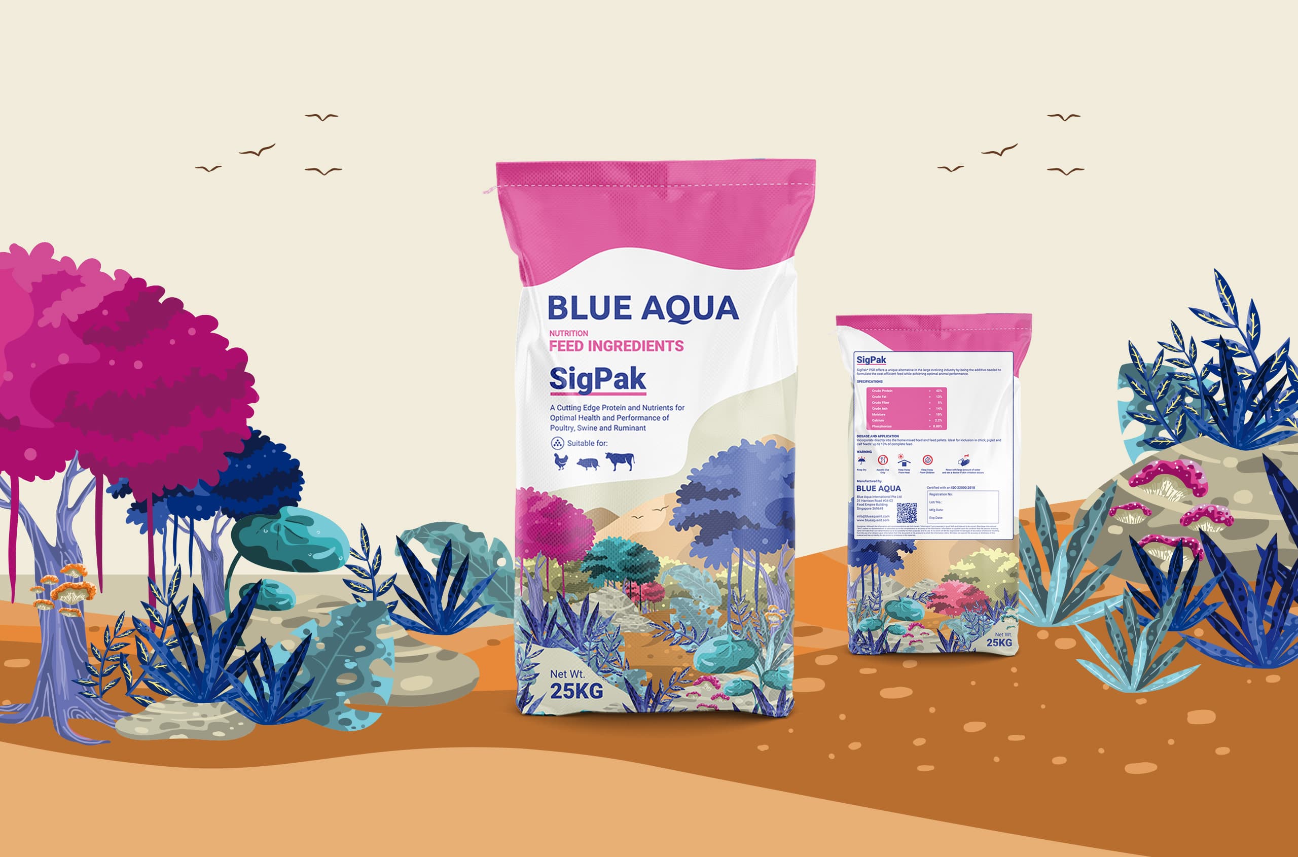
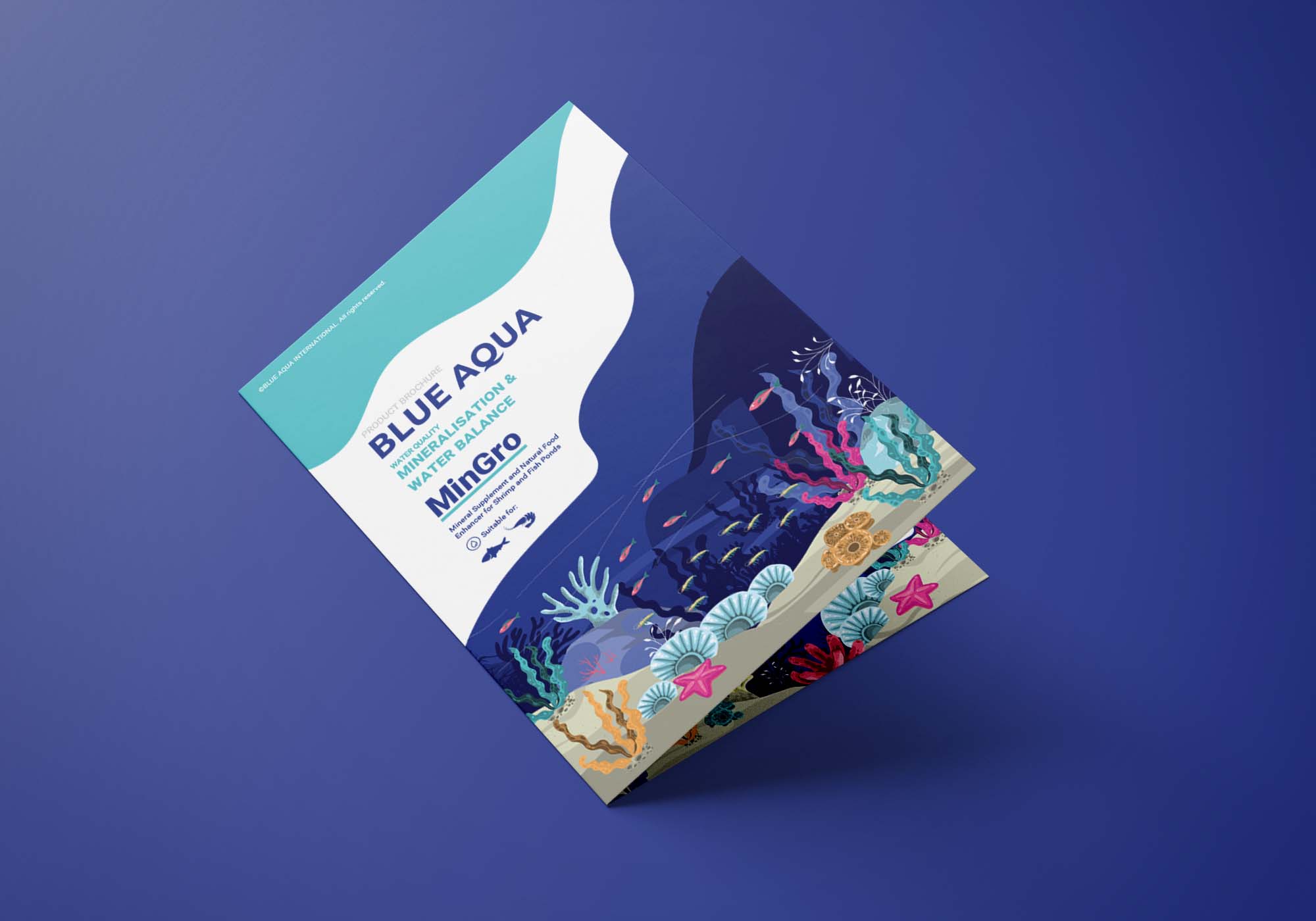
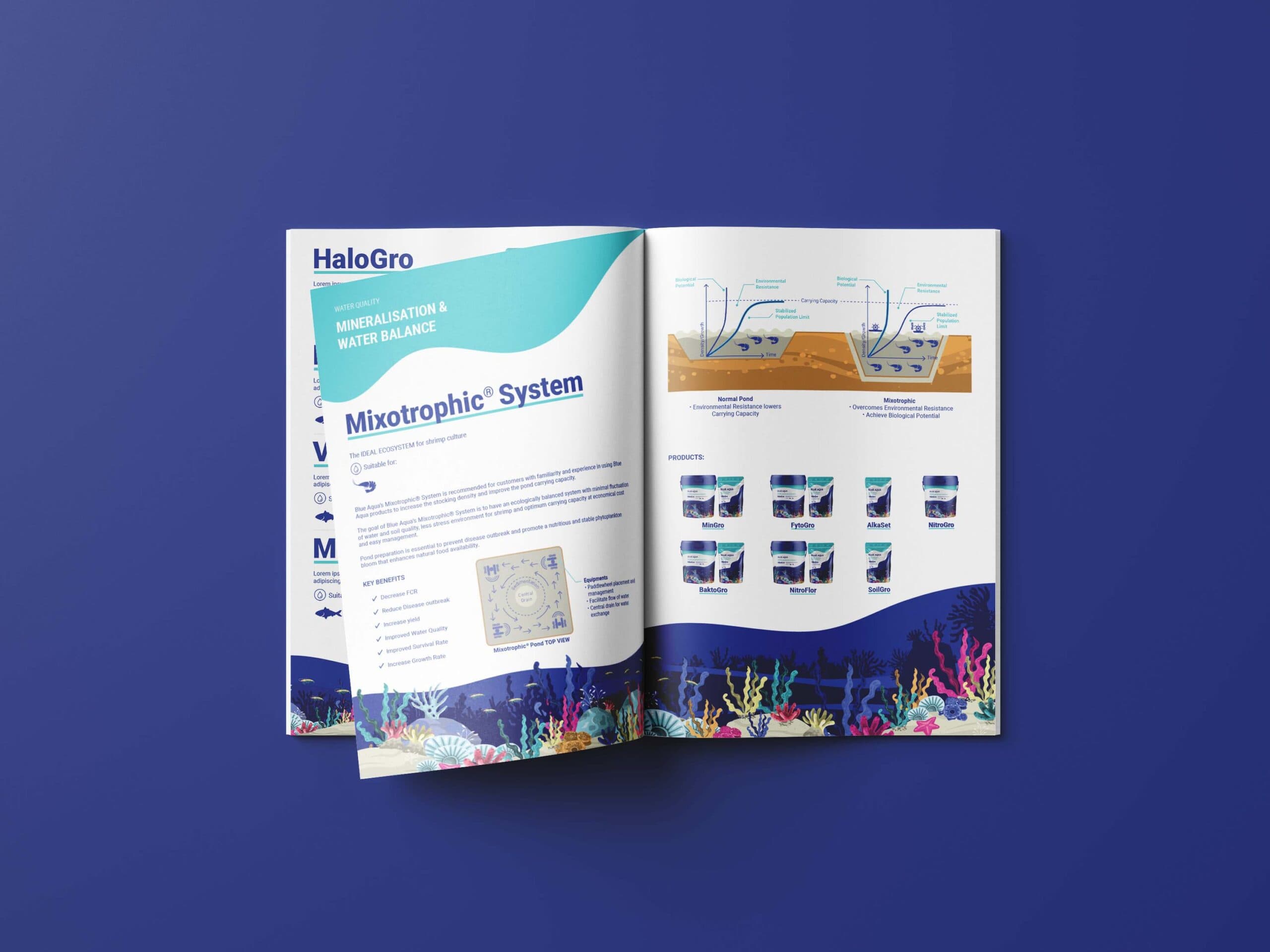
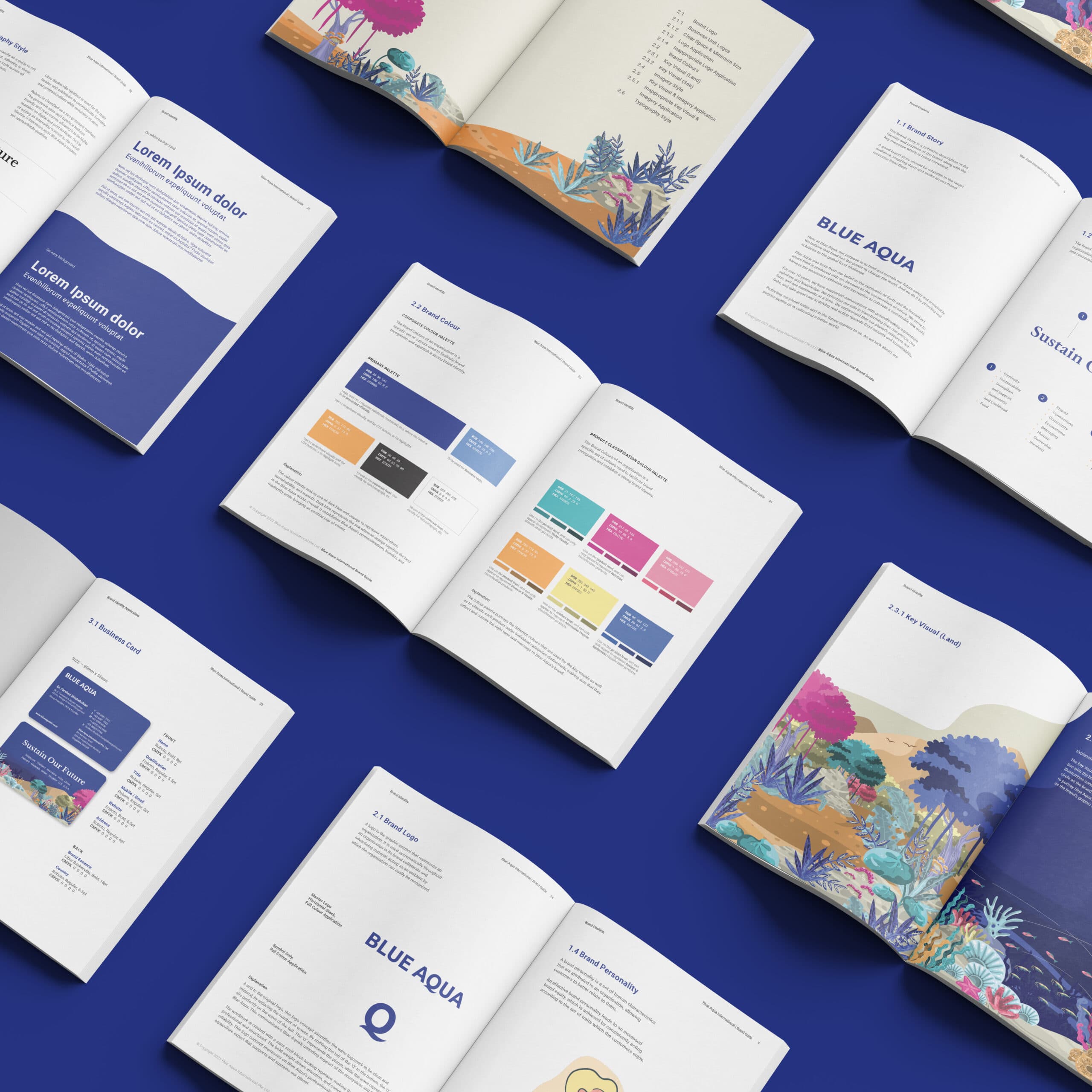
The identity combines clean layouts, organic graphic shapes, land-and-sea illustrations, and authentic aquaculture imagery to express both expertise and human touch.
A colour and icon system was developed to organise Blue Aqua’s product categories, helping audiences navigate its solutions more easily.
Across applications, the refreshed identity presents Blue Aqua as a professional, modern, and purpose-driven aquaculture brand committed to sustaining the future.
{ THE DIFFERENCE }
{ Brand Positioning }
{ Brand Identity }
{ Brand Touchpoints }
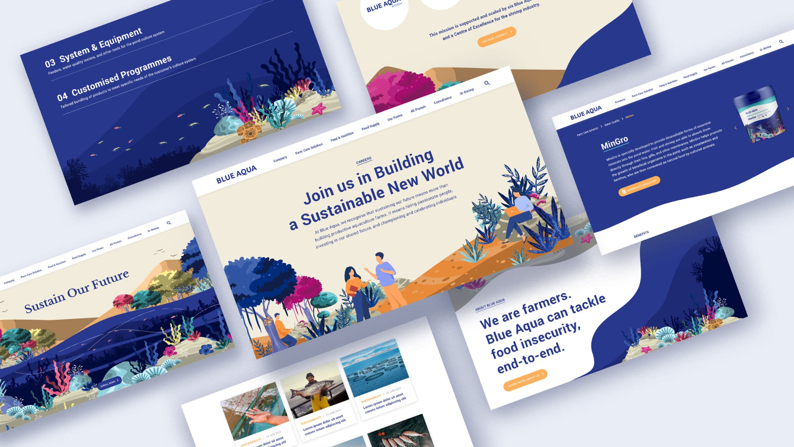
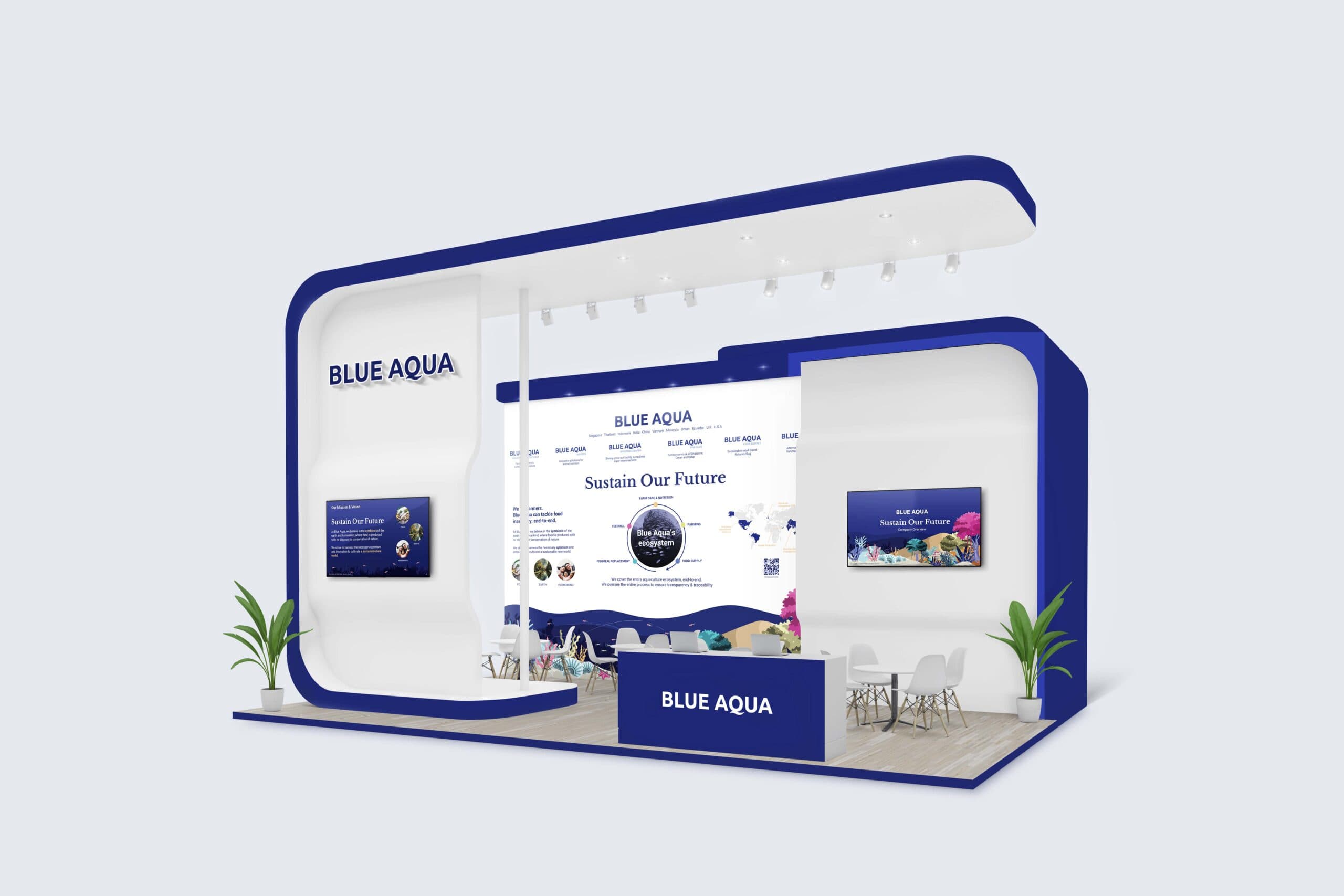
Blue Aqua’s brand touchpoints extend its “Sustain Our Future” purpose across corporate, product, educational, and digital applications, creating a cohesive identity for a diverse aquaculture ecosystem.
The visual system was designed to work across a wide range of applications, from corporate collaterals and environmental graphics to social media, product communications, and campaign materials. Each touchpoint uses Blue Aqua’s graphic shapes, illustration style, photography direction, and colour system to communicate its expertise in aquaculture while keeping the brand warm, modern, and accessible.
To support clarity across its many offerings, we developed icons and colour classifications for different product categories, including water quality, nutrition, disease and health, system and equipment, and alternative protein. This helps simplify complex information while strengthening recognition across Blue Aqua’s brand touchpoints and communication channels.
{ Brand Rollout }
For Blue Aqua, what stood out to us was how much heart there is behind the business. They are not just providing aquaculture solutions, they genuinely care about farmers, communities, and how we can grow food more responsibly for the future. So for the brand identity, we wanted it to feel clear and professional, but also warm and approachable. It should help people understand Blue Aqua’s expertise, while still showing the human side of what they do.